Hollywood “The Krazy Edition” by Bumdog Torres by Kyun Ngui

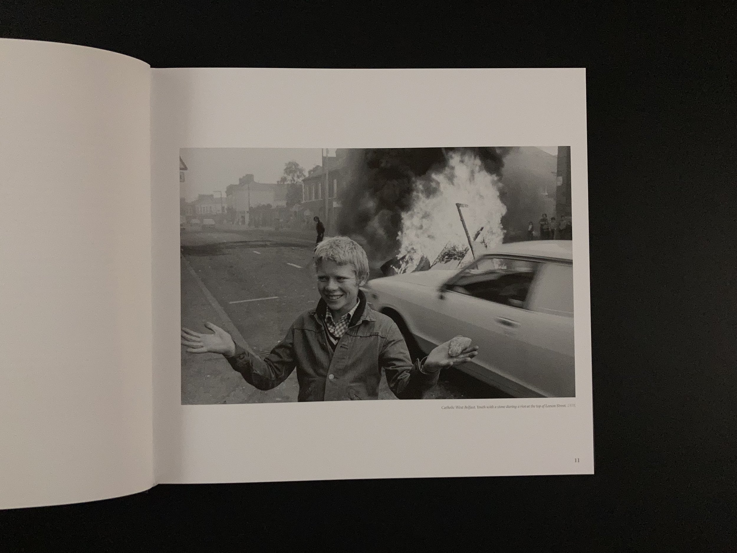
This is not a review. I am not qualified to speak about homelessness and homeless people, which is the main subject matter of this book. Bumdog Torres (the author) is, however, because he speaks as one of them.

Bumdog Torres is “a career homeless bum who sells photo prints, DVDs, Photobooks, T-shirts”, according to his Instagram profile, which is a somewhat modest description given his photobooks have been reviewed by Robin Titchener and he counts the great and the good (photobgraphers and photobook enthusiasts) among his followers.

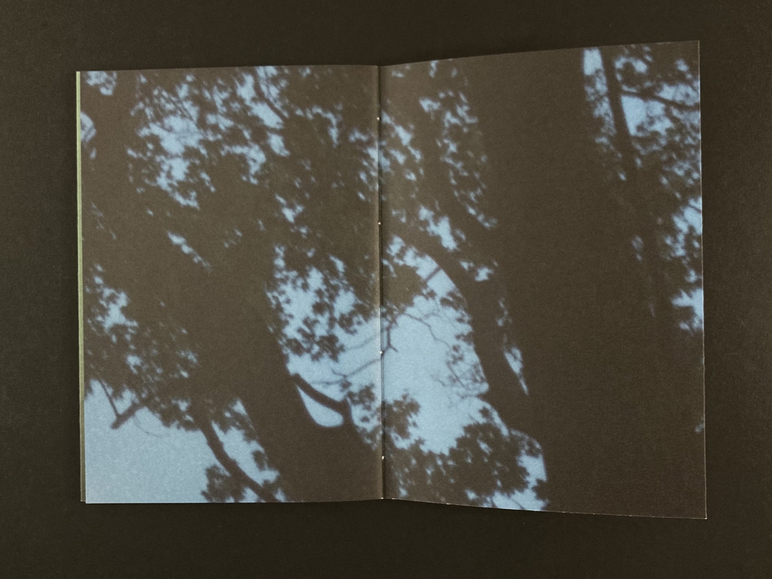
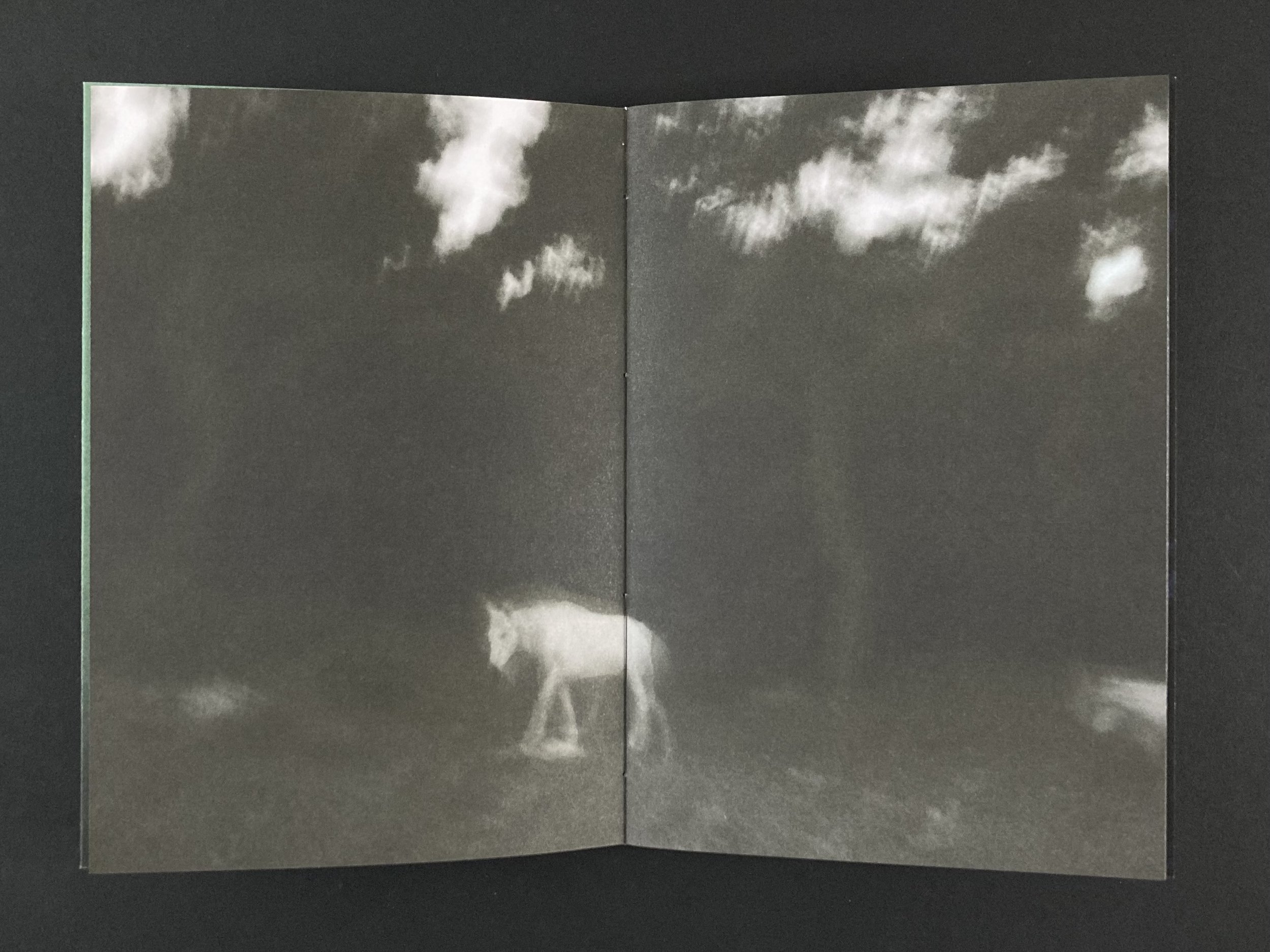
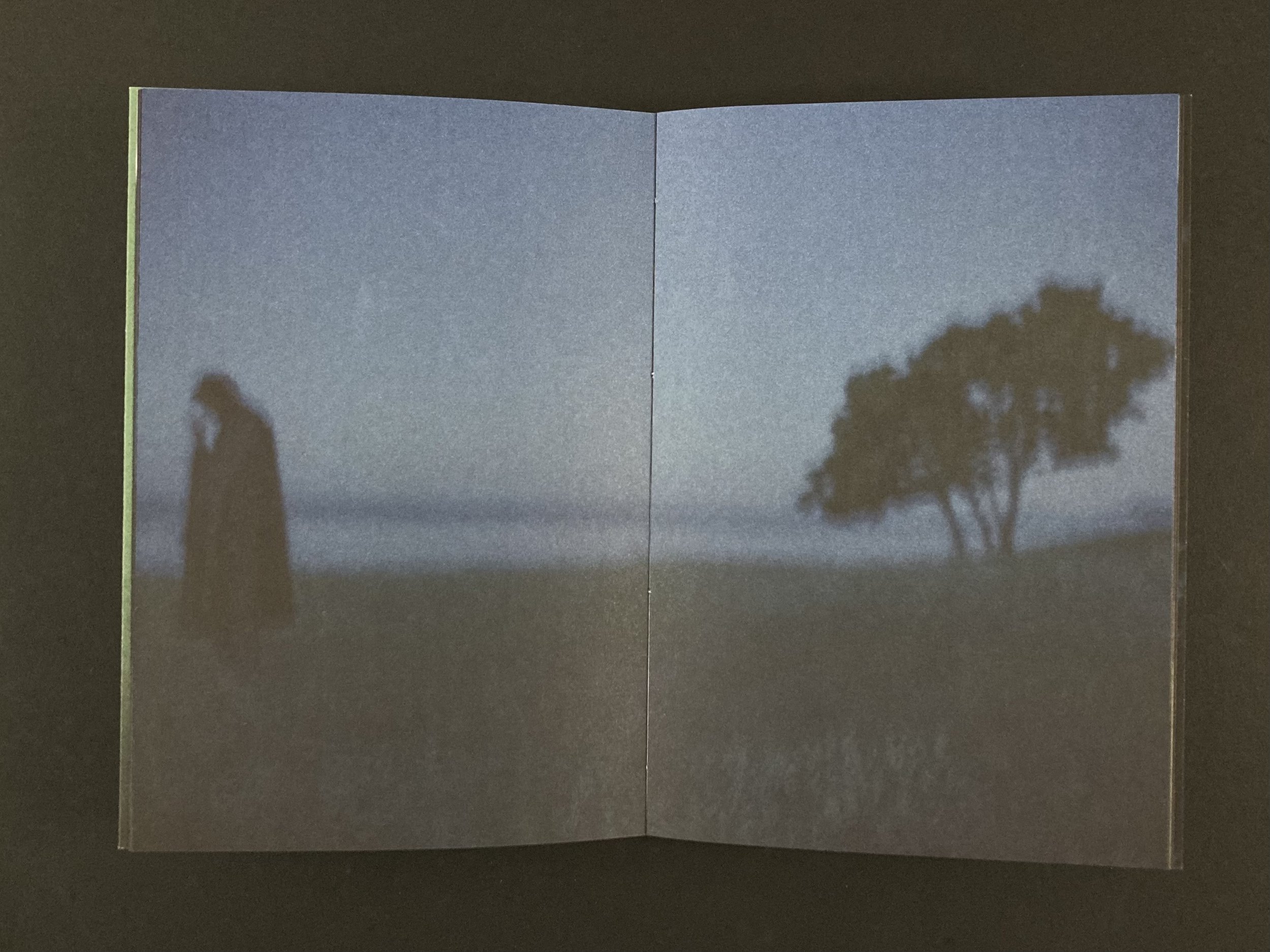
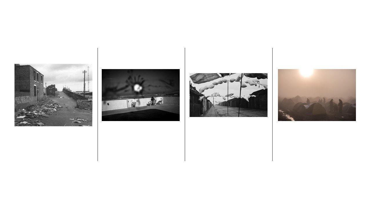
This book is nearly an inch thick (about 2.5cm). It has photos and text in roughly equal measure. At times, the whole page is text. It is part story-telling and part diary/journal and 100% gripping (to me anyway. I pretty much read through it in one sitting).

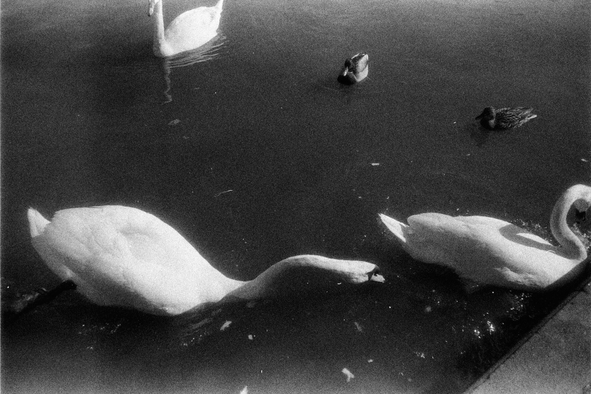
Jim Goldberg’s Raised By Wolves is an early inspiration.

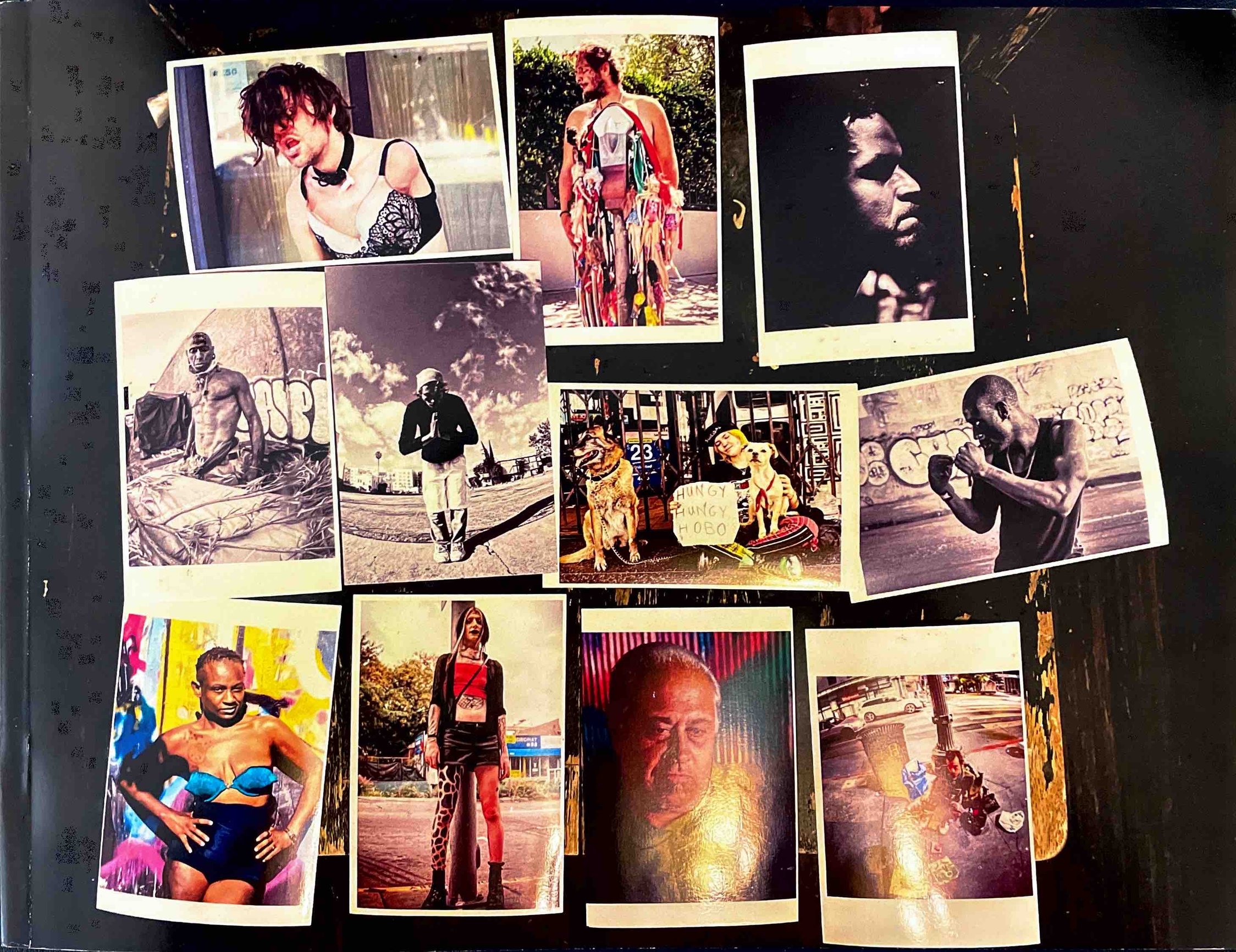
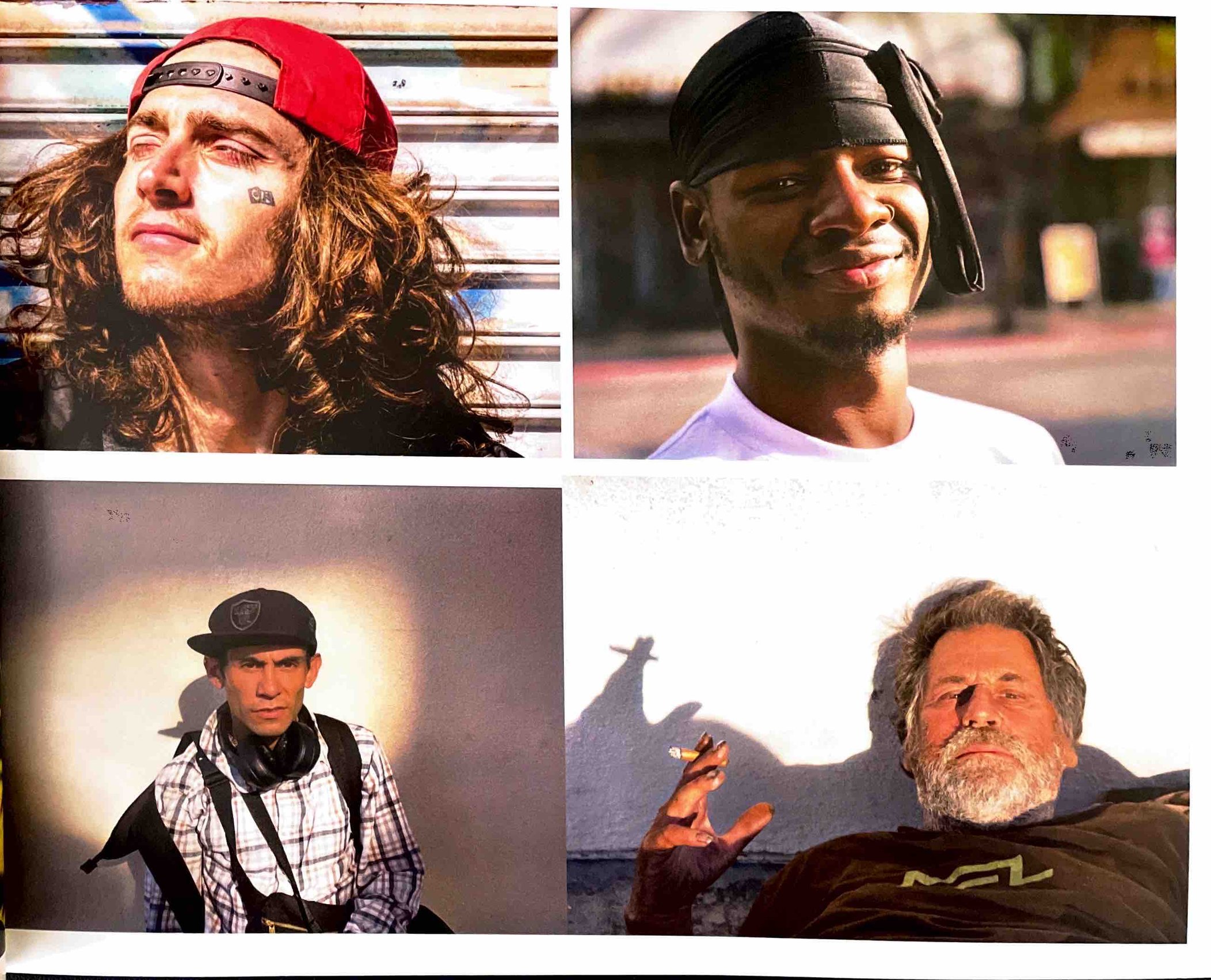
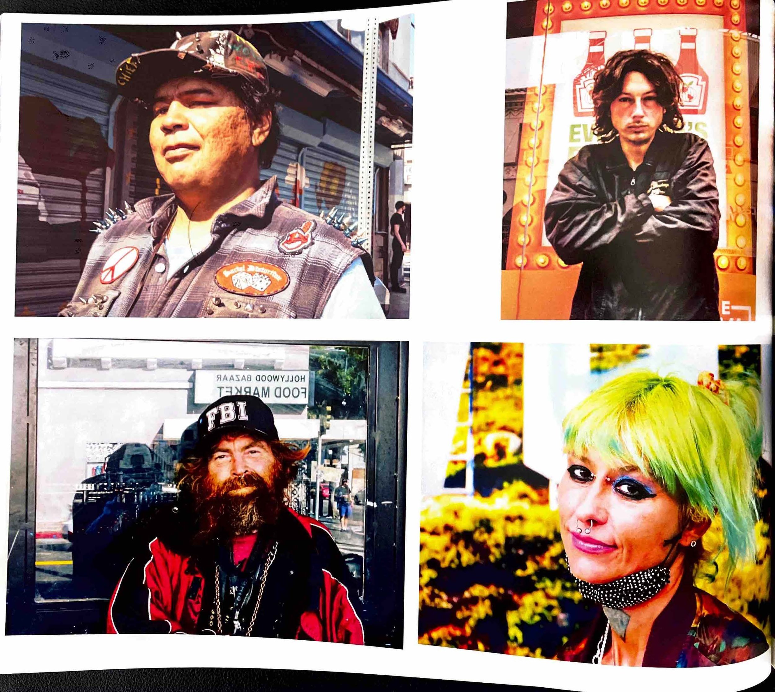
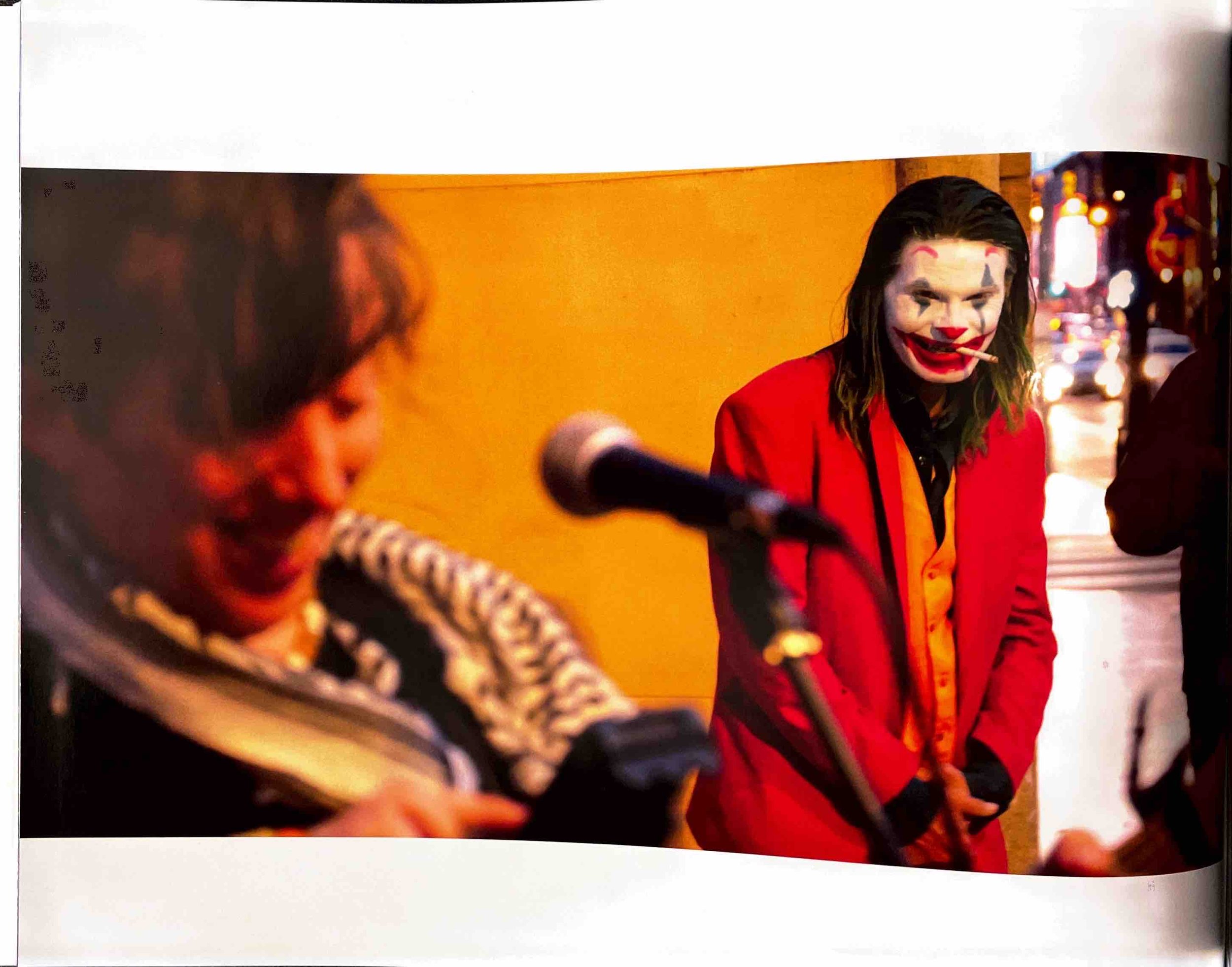
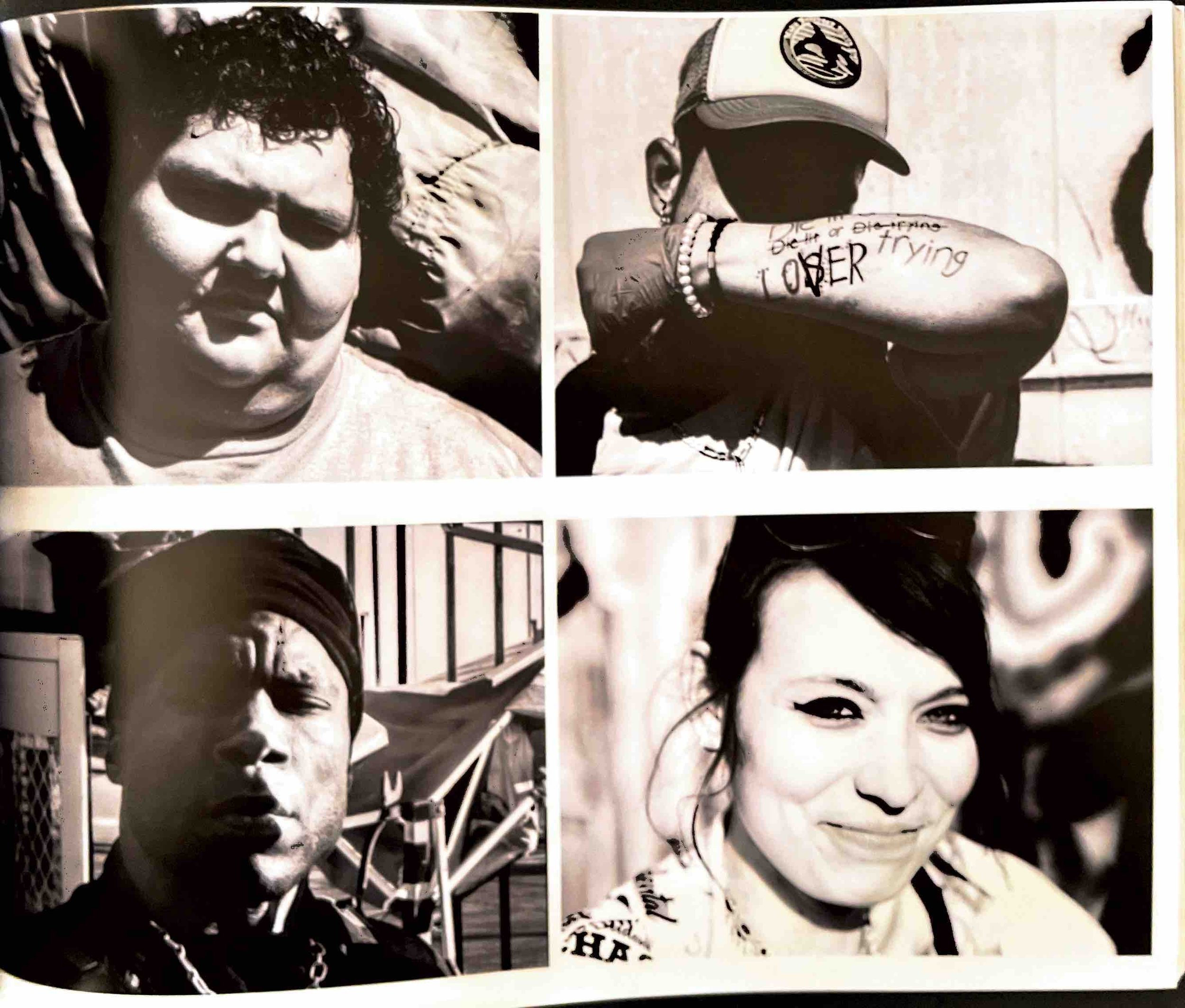
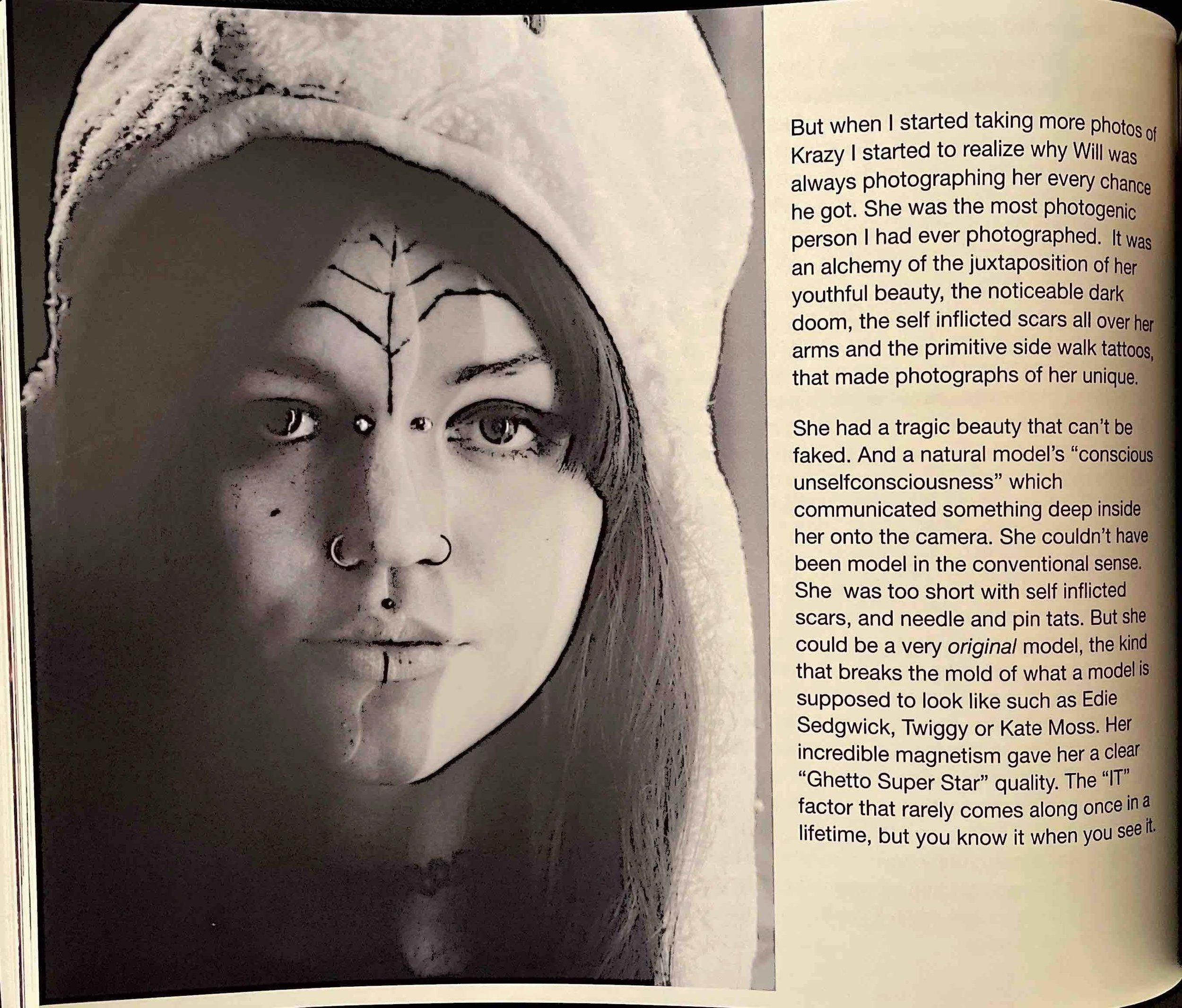
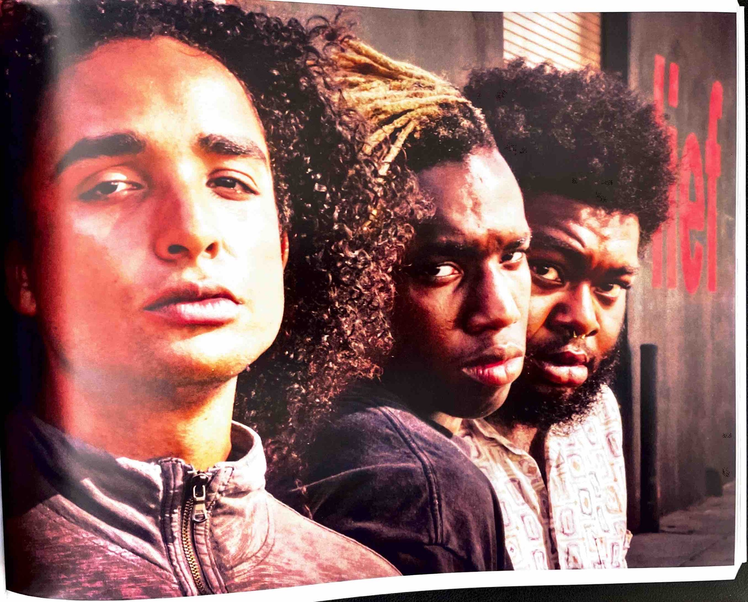
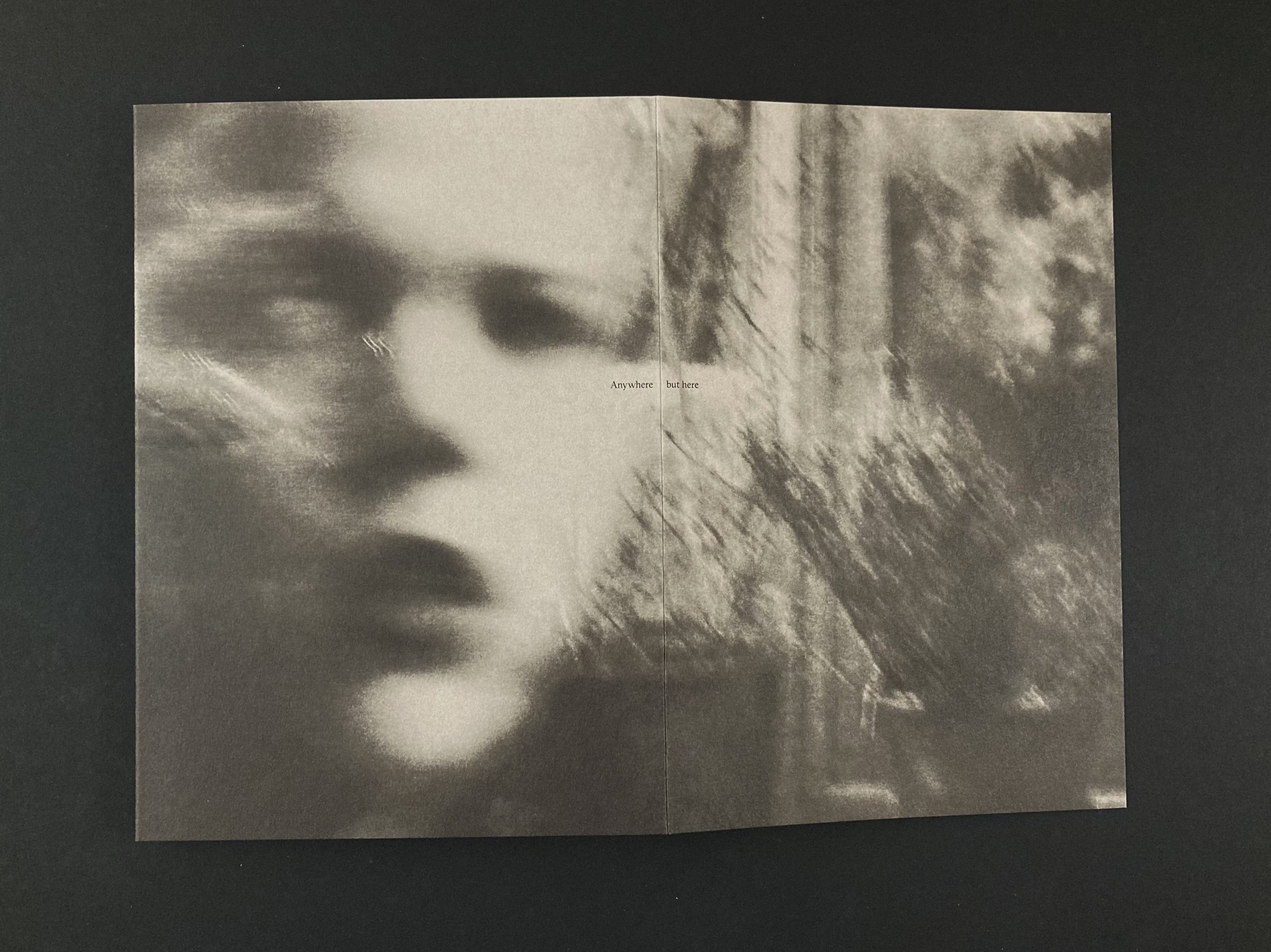
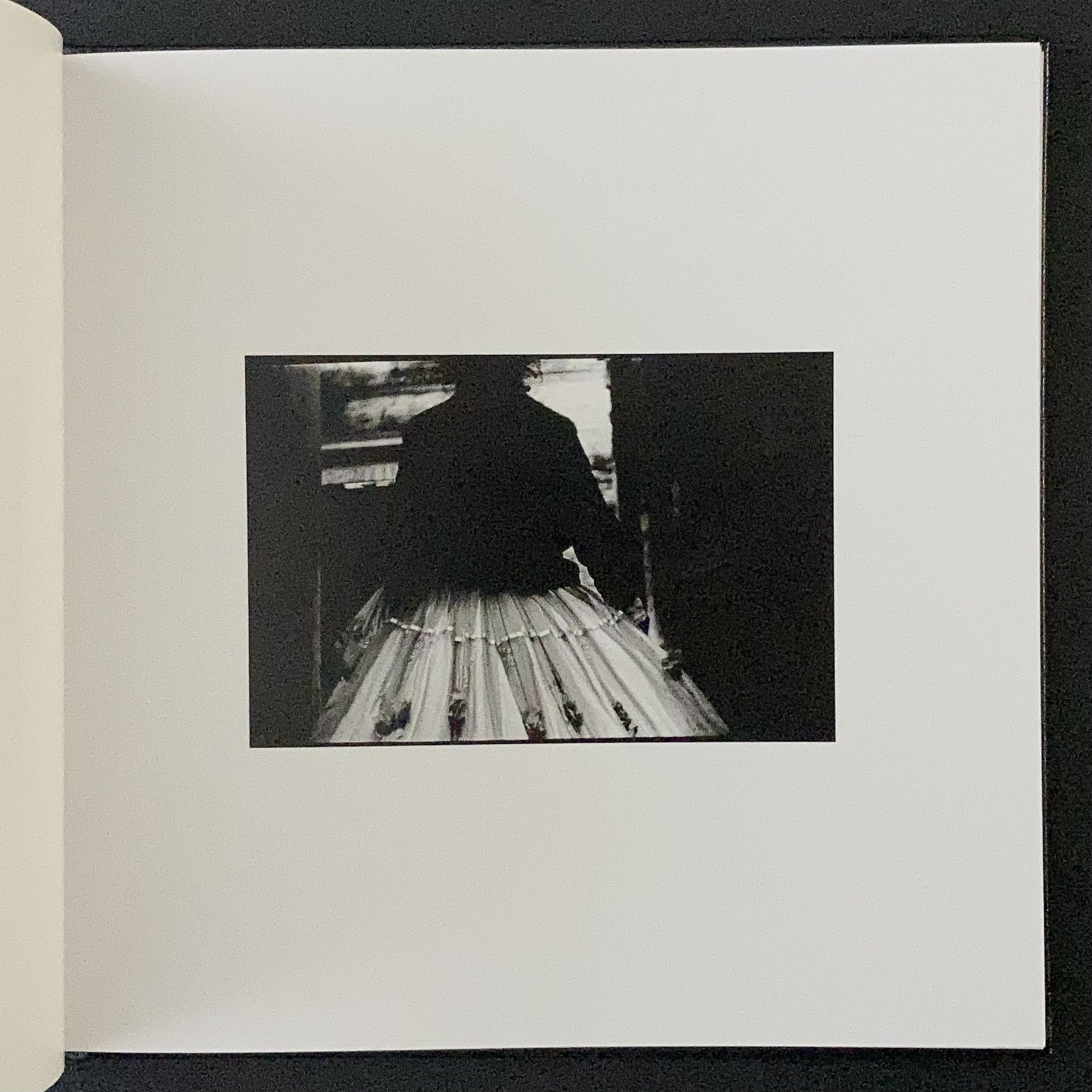
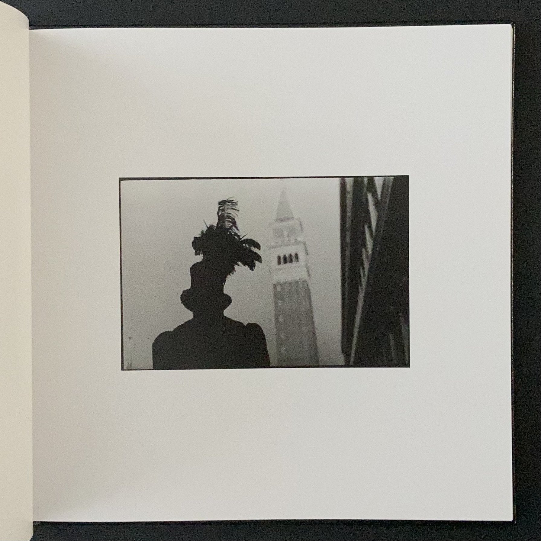
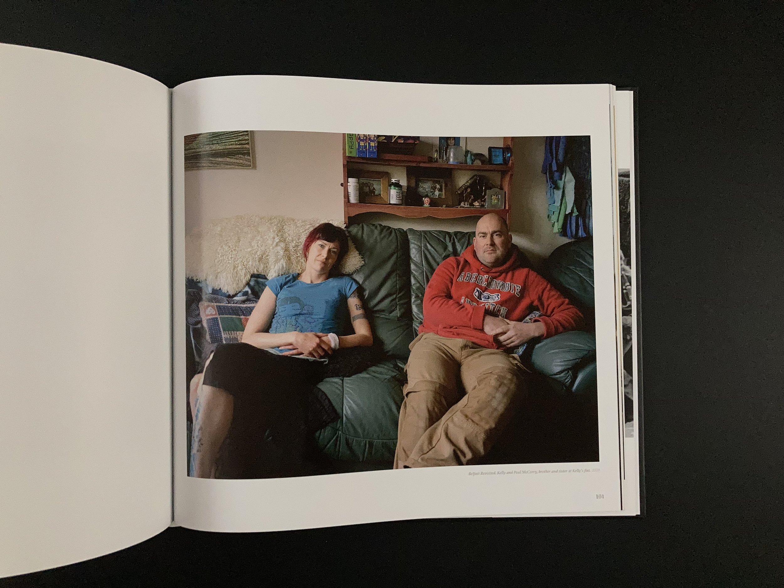
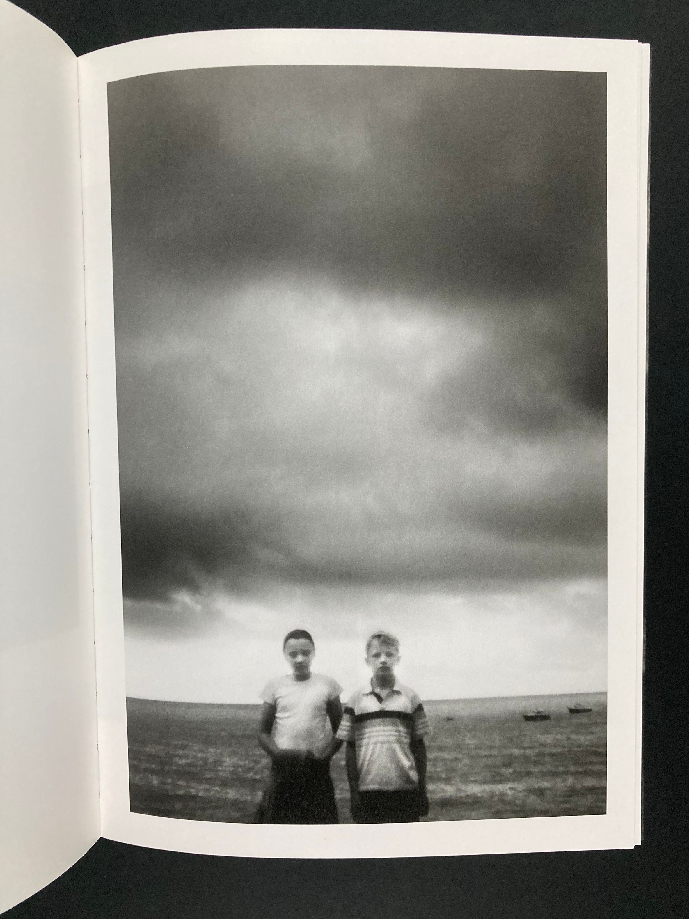
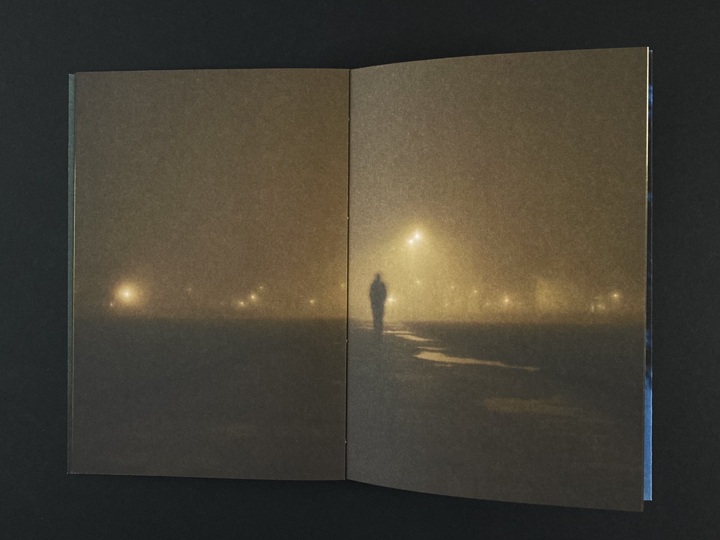
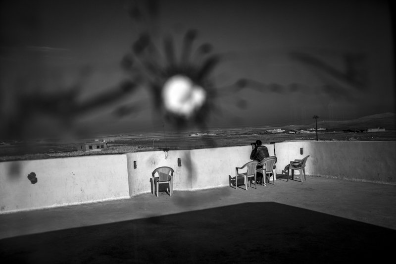
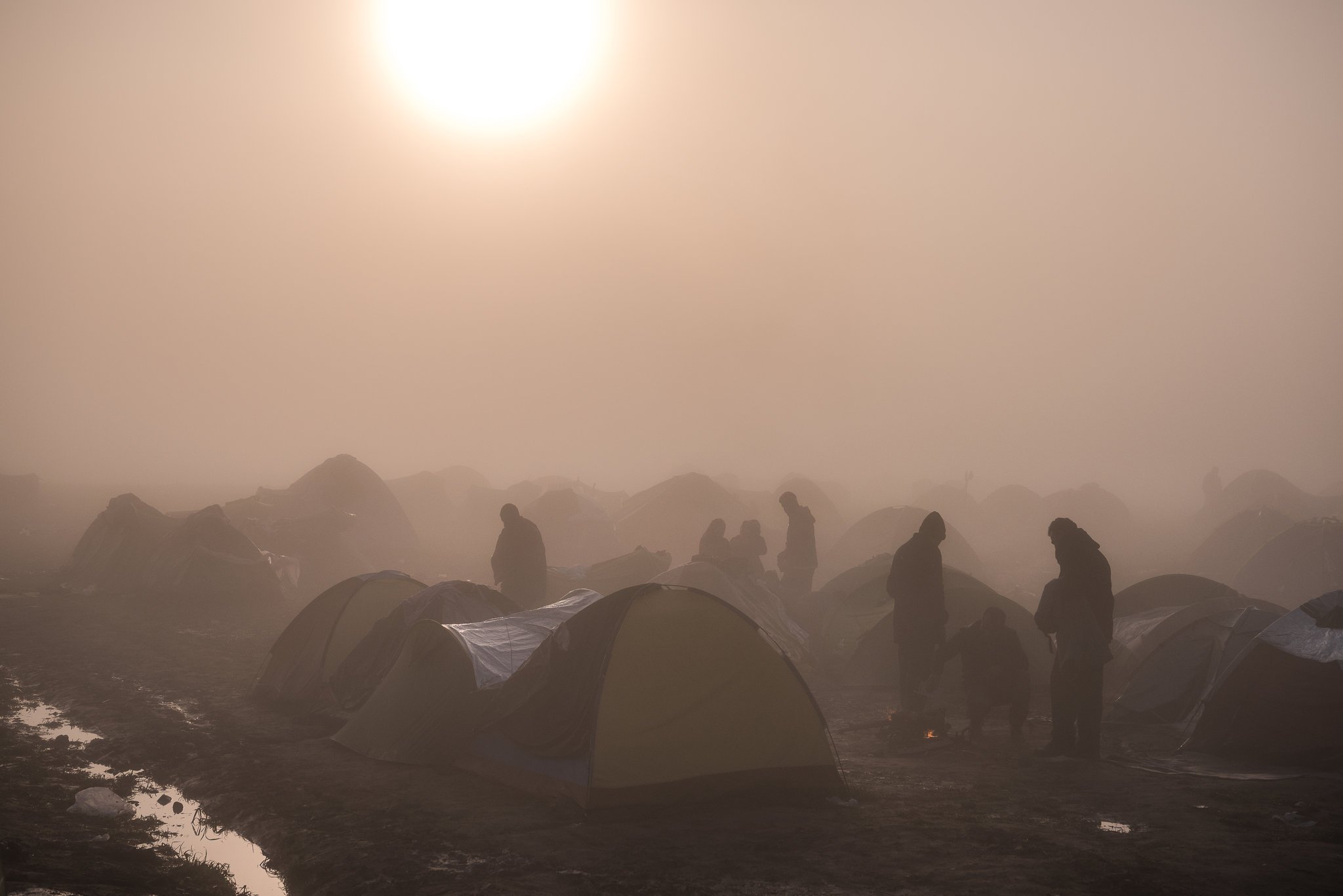
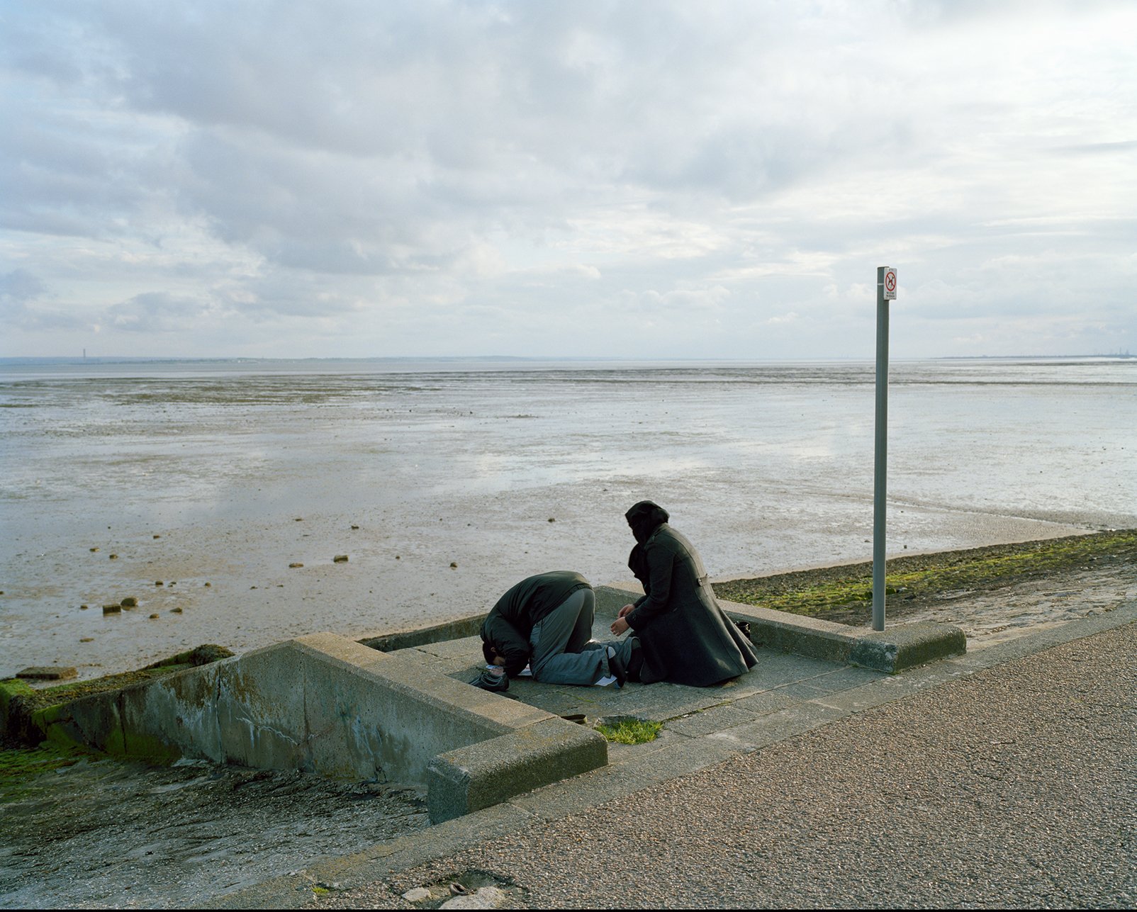
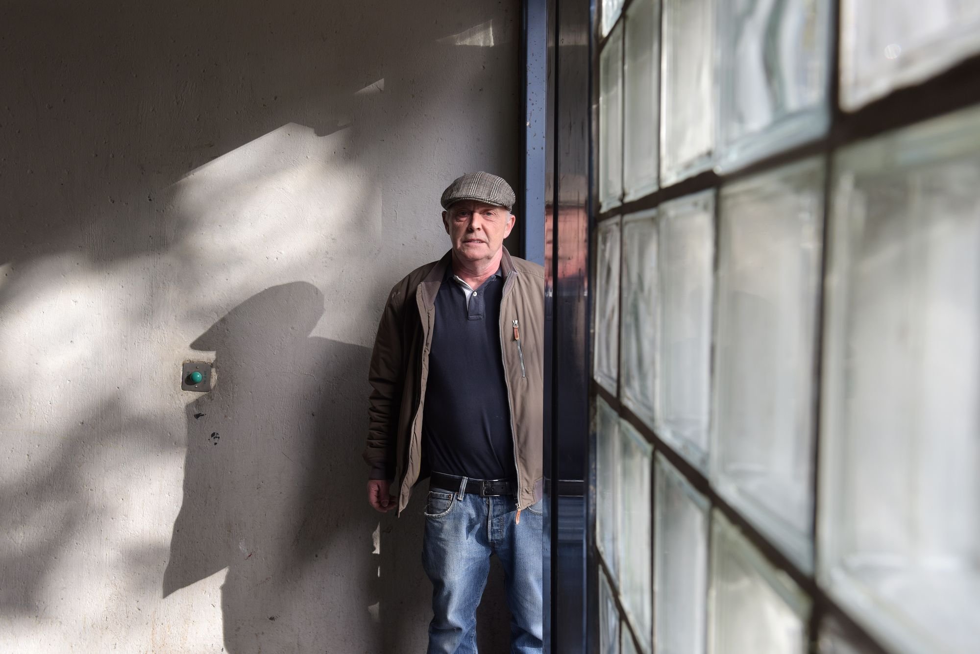
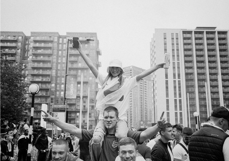
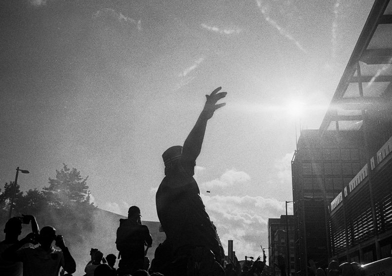
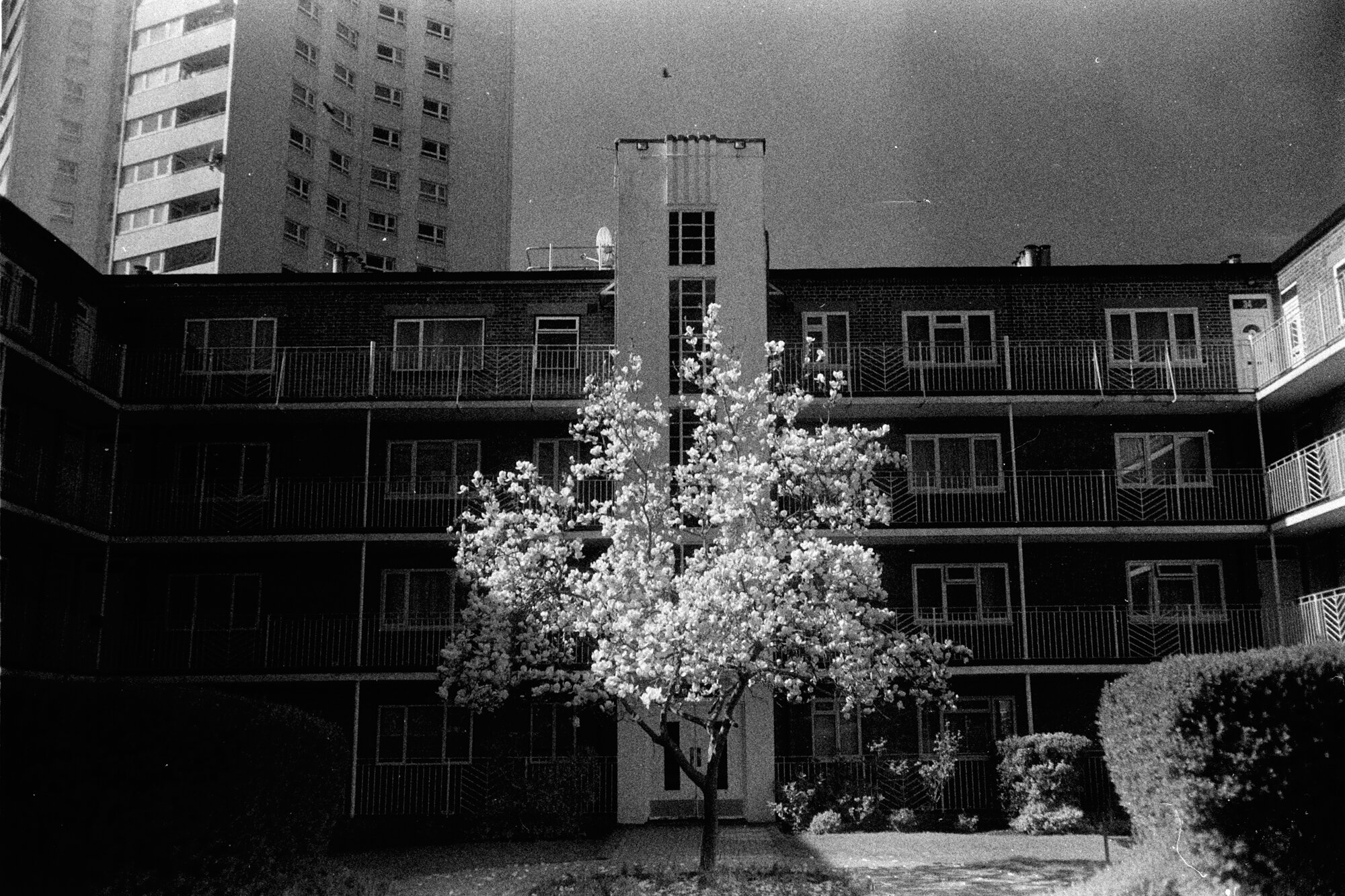
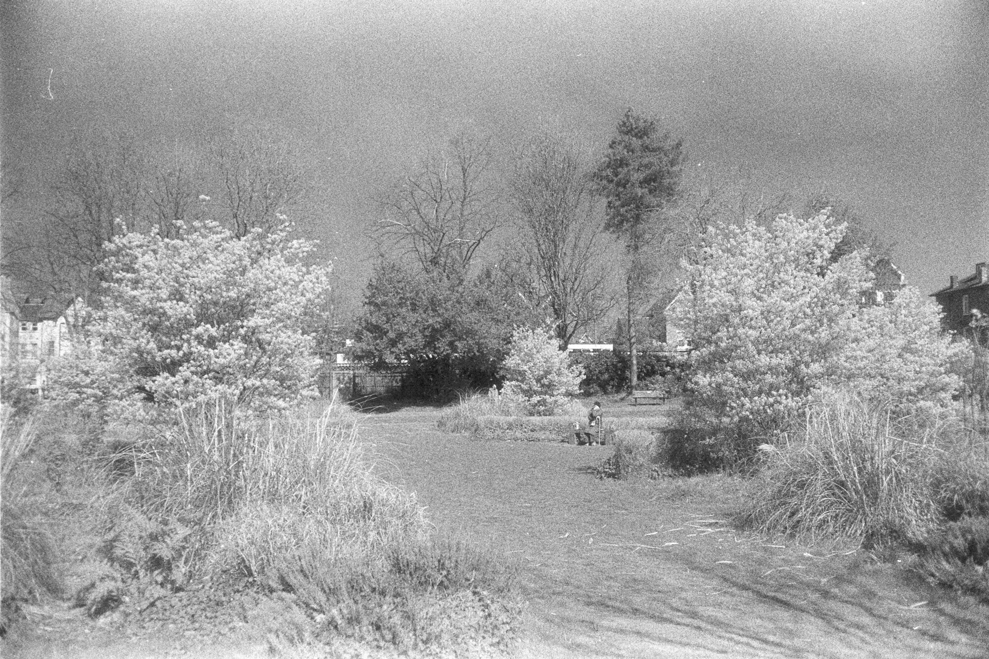
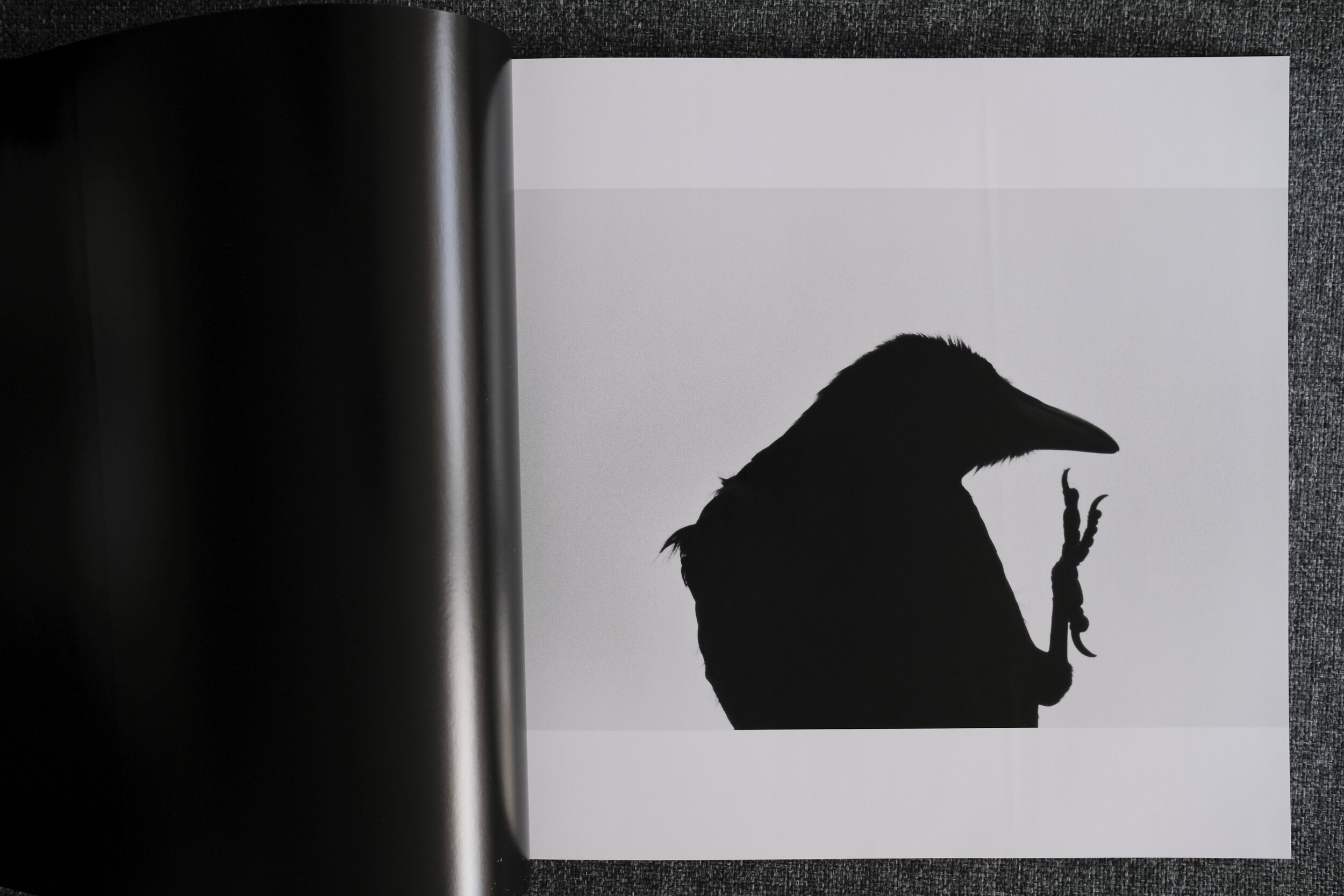
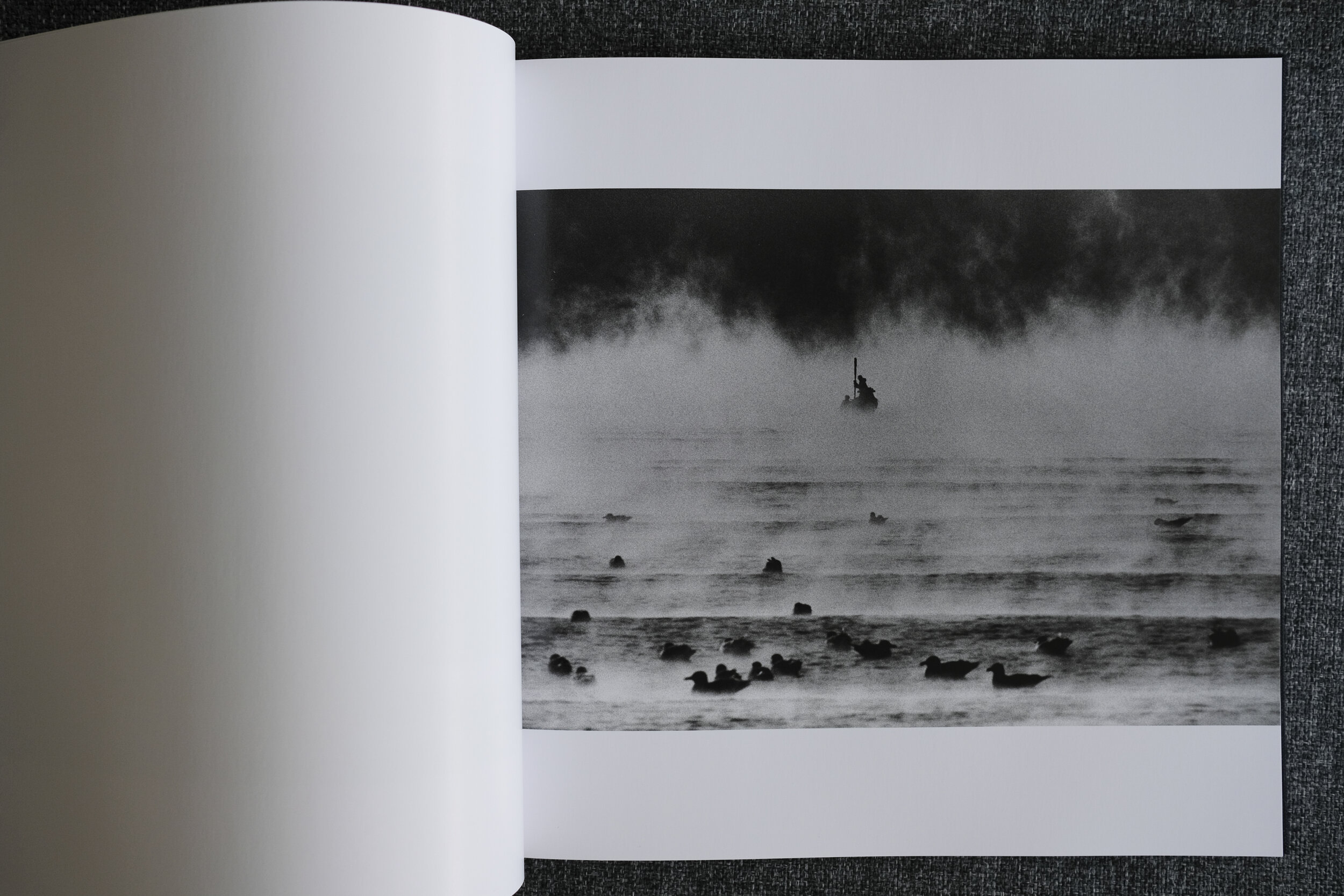
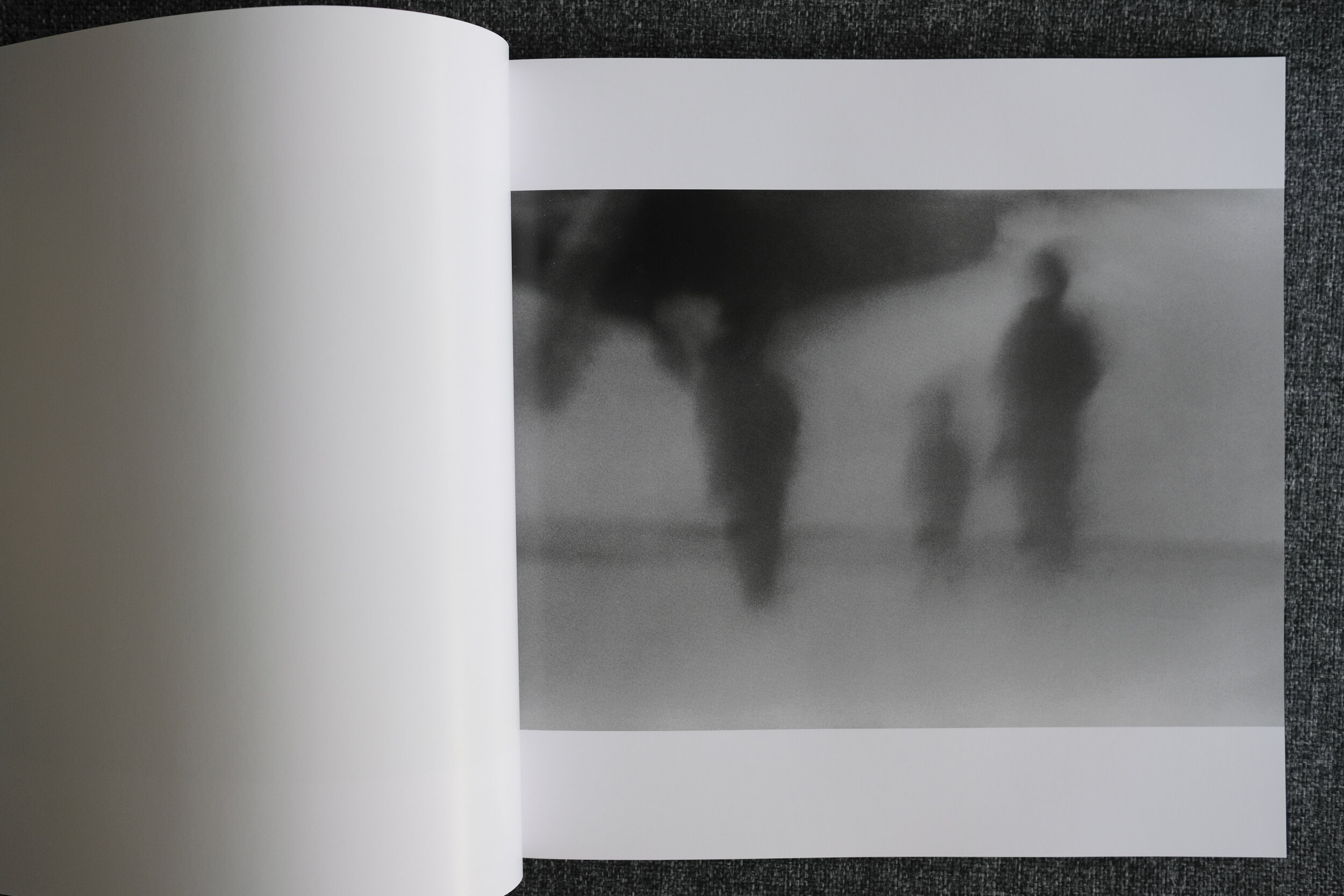
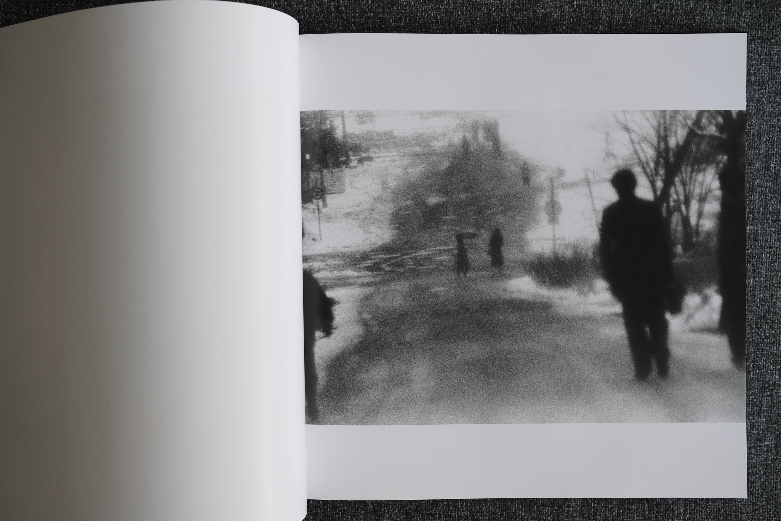
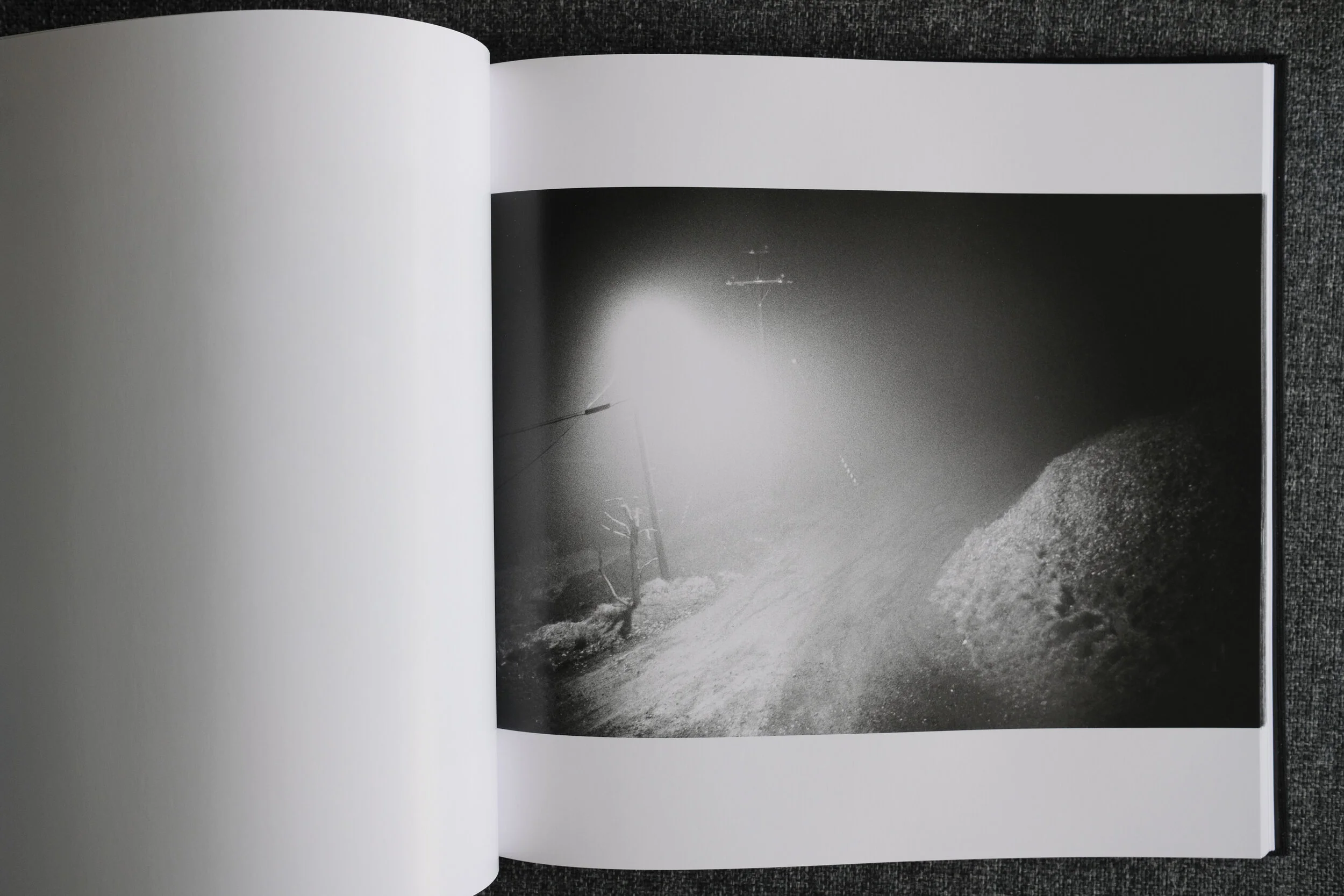
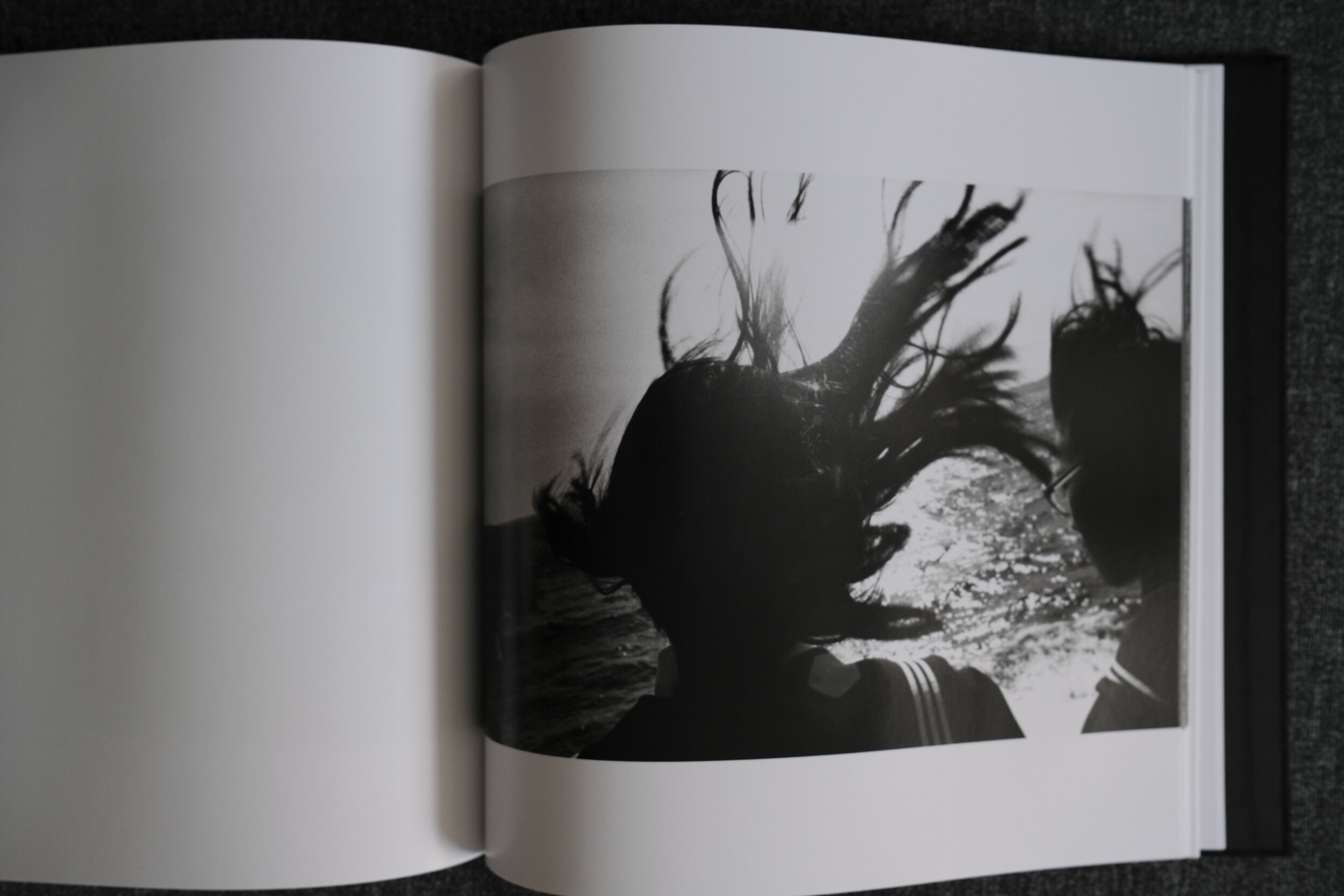
In a similar vein to Jim Goldberg’s “Raised by Wolves”, to whom the book is jointly dedicated, this is a raw, unflinching, at times tender and compassionate, glimpse into the homeless community in Hollywood (his family, as Torres calls them) with a special focus on one character called Krazy, a teenage homeless girl, which takes up about a third of the book. Though not explicit after the first few pages where he talks about himself, Torres’s presence and his relationships with the people he photographs comes through.

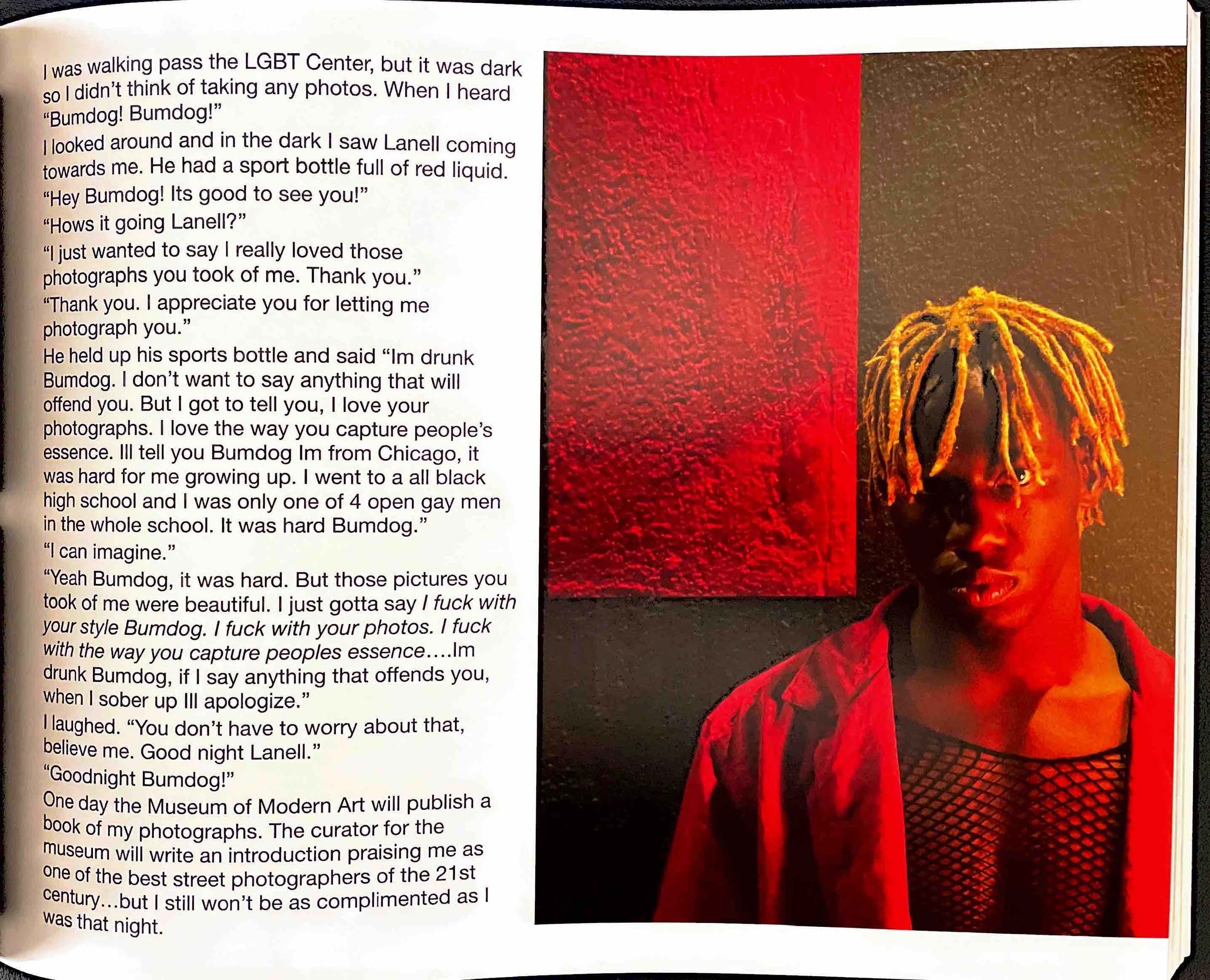
Of his photography, Torres writes “ If met someone who I thought could genuine comprehend what I was saying, Id tell them the real deeper truth. "I do this to keep from going crazy. When youre out here on the streets and if you dont have a project to keep your mind busy you'll go insane." To that they would say "I hear you. That's the truth. Yeah you can take my picture bro."“
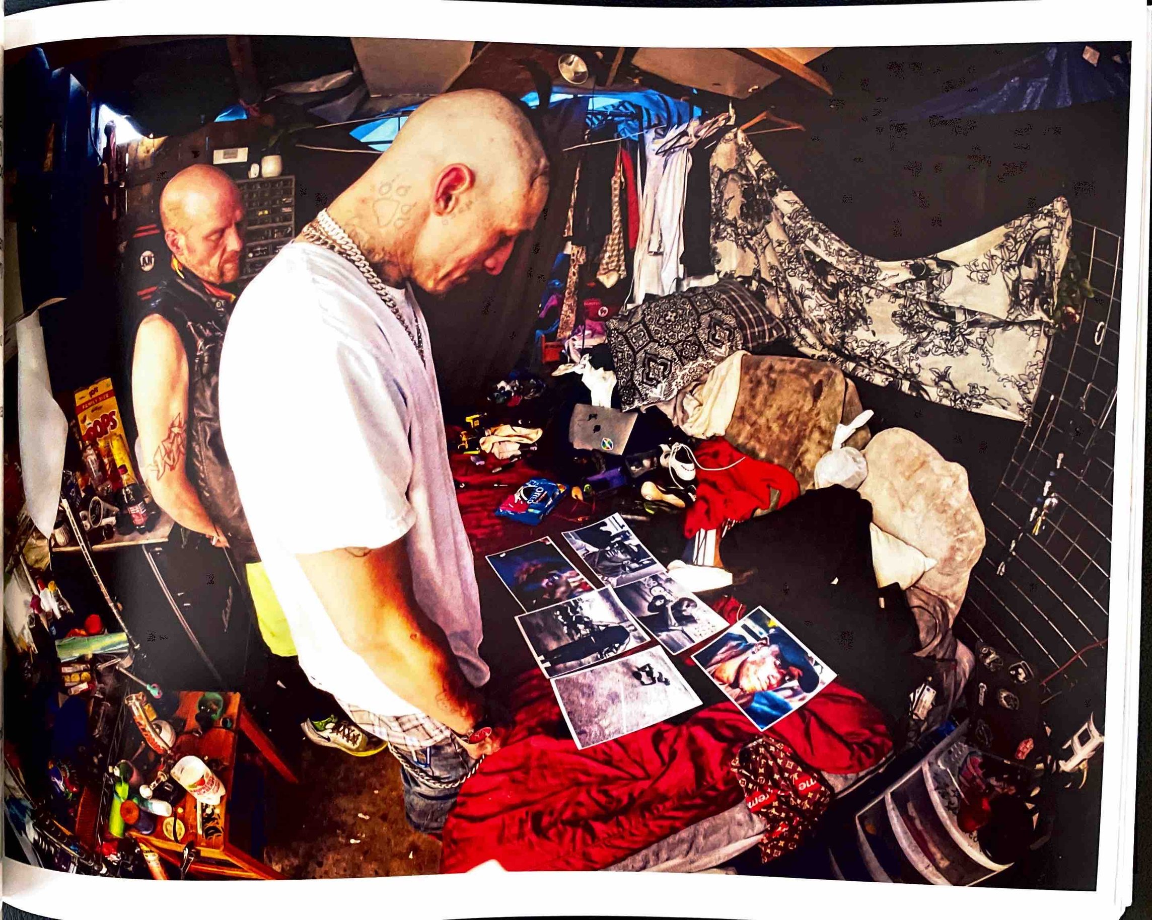
Im taking photos of my family. My photo books aren’t Books of Photography, they’re my family albums, for my family to be remembered.

Of his photogrpahing the homeless people, he says “... he was taking photos of his subject. Im taking photos of my family. My photo books aren't Books of Photography, they're my family albums, for my family to be remembered.”

Of Krazy, “Despite how innocent and sweet she was there was a dark doom around her aura. you could feel it”. The story of Krazy would get darker and darker as it unfolded. This is real life but it would not be amiss as a movie plot. Torres posted a 60-part series on his Instagram account and it is worth a read.

*Typos in the quotations are as per the book.

Mike Brodie of A Period of Juvenile Prosperity (APOJP) fame, makes an appearance. Torres talks about his encounter with Brodie and demystifies the man, the myth and the legend. Warts and all.

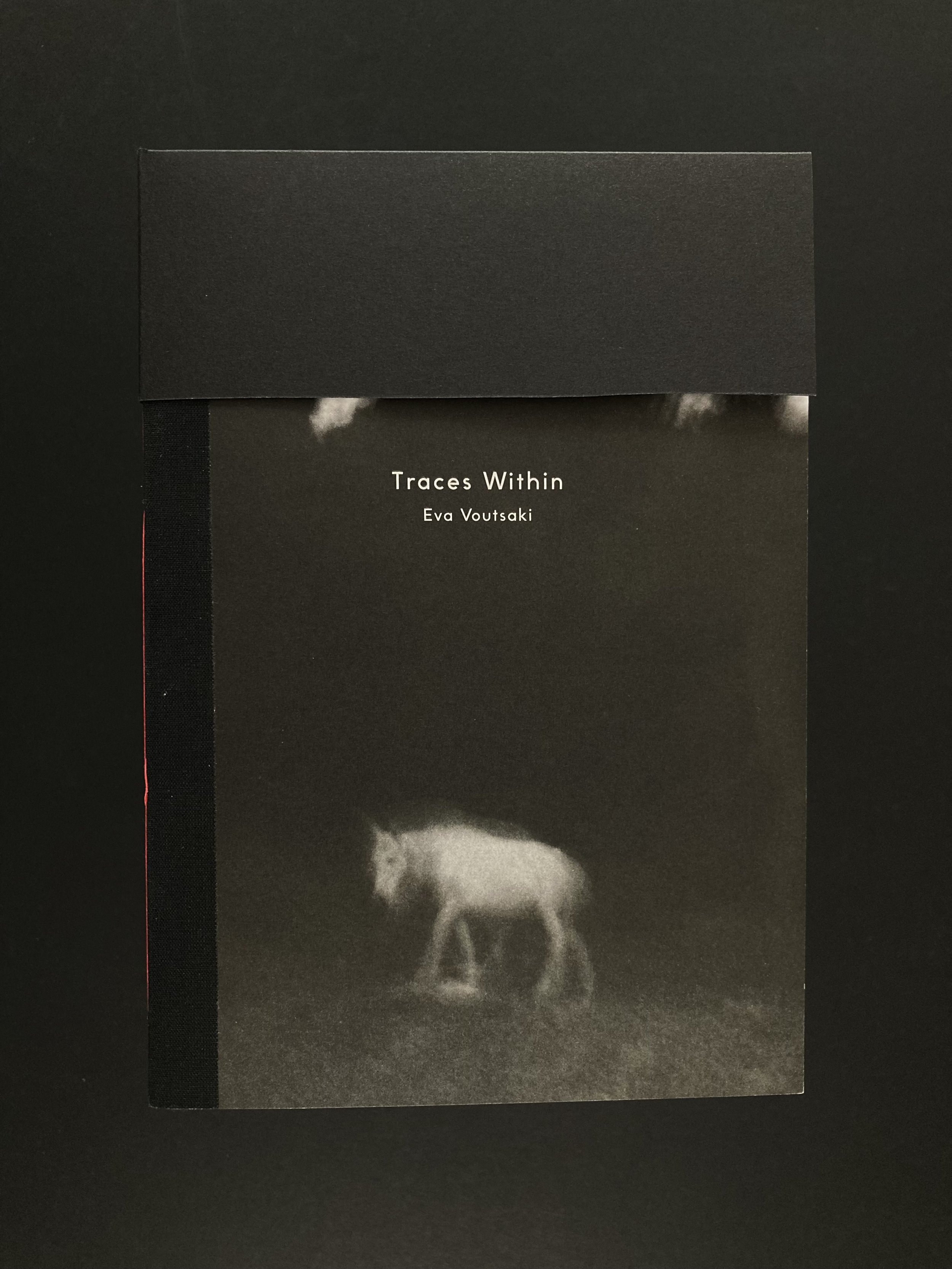
Self-published. 1st Draft of 50 copies.

Ray's A Laugh by Richard Billingham MACK, 2024. by Kyun Ngui

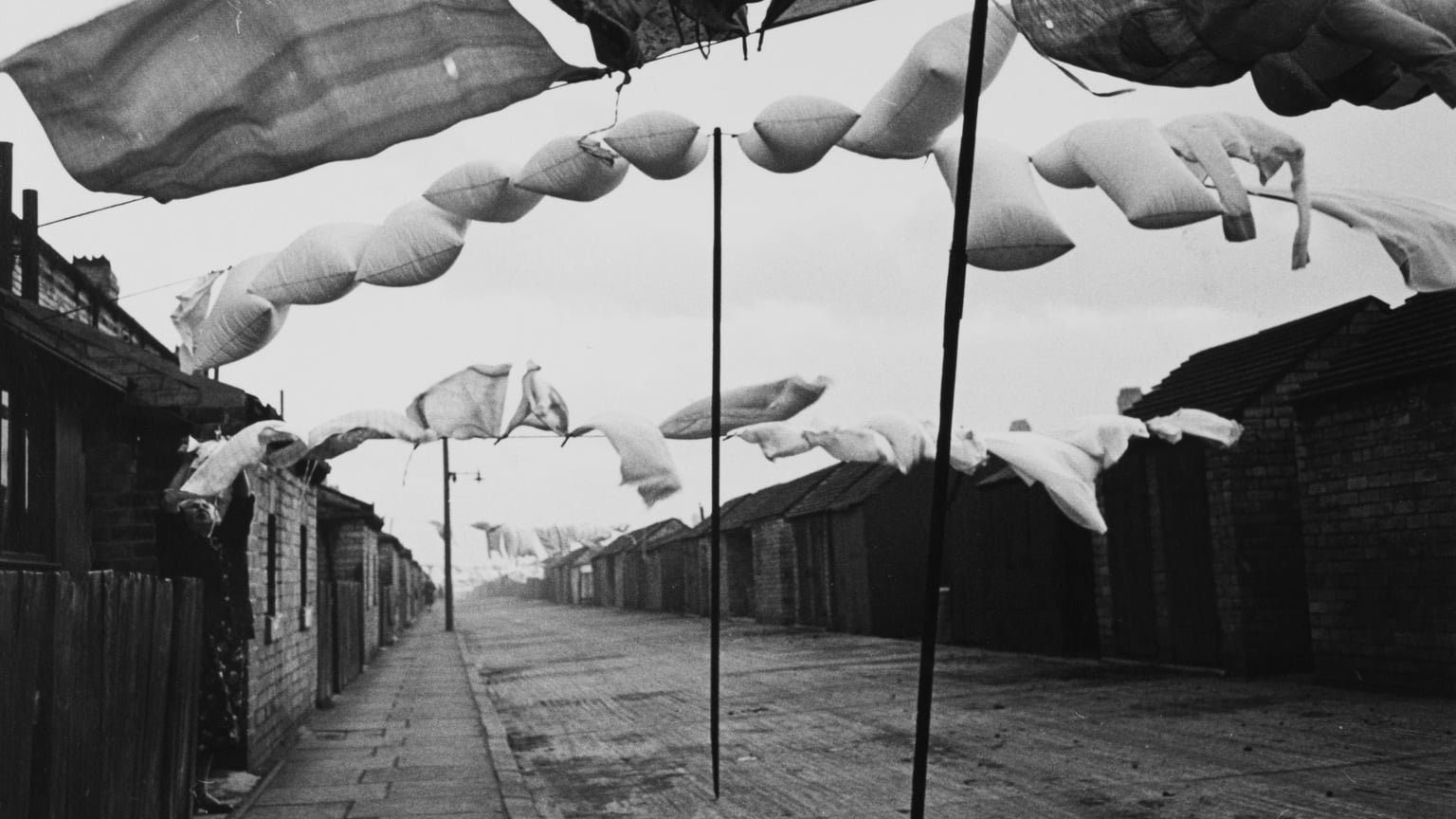
Ray’s A Laugh by Richard Billingham, MACK, 2024.

“First published in 1996 to enormous acclaim, Richard Billingham’s Ray’s a Laugh is one of the most significant photobooks of the turn of the twentieth century, as well as a cornerstone work of the Young British Artists generation. Formed of starkly intimate images of Billingham’s often chaotic parental home under the heavy effects of alcoholism and poverty, the book was produced in the 1990s with editors Michael Collins and Julian Germain. This new edition restores Billingham’s original vision for his deeply personal work for the first time. Including numerous unseen images and a distinct approach to sequencing inflected by Billingham’s training as a painter: it constitutes a ‘director’s cut’ and reintroduces a vital and consistently challenging work for a new era.”

Read More

A Period of Juvenile Prosperity by Mike Brodie by Kyun Ngui

A Period of Juvenile Prosperity is a stunning photographic work by Mike Brodie that captures the spirit of youth and freedom. Brodie, a self-taught photographer from Arizona, embarked on a train-hopping adventure across America in his early twenties, documenting the lives of the young and restless who similarly eschewed the traditional norms of society.

Read More

Blog Posts Summary by Kyun Ngui

Venice by Giacomo Brunelli (June 2022) by Kyun Ngui

Giacomo Brunelli's latest offering sees him turning his eye and camera to Venice. He says that "Venice is a project I decided to start in response to the fragility of the city after the exceptional November 2019 'Acqua Alta' …" It is his first self-published book and in his unique style, Giacomo gives us an expressionistic and atmospheric interpretation of Venice.

For those not familiar with Giacomo’s work, it can be loosely summed up as film noir street photography. However, he has published books on subjects as diverse as animals (The Animals, his first book) and Self Portraits (published 2017). He has also published New York, Eternal London, and Hamburg.

I first came across Giacomo's work through his book Eternal London (2016), which followed an exhibition at The Photographers' Gallery in 2014. I remember being struck by his style and it left a strong impression on me.


I made a modest contribution to Venice: I was fortunate to work with Giacomo in the very early stages of Venice, mocking up ideas for the cover, and then helping with the digital book layout.

The first 250 copies of Venice are numbered and signed. There are also two limited special editions of with prints (these are not in the book). Venice and other books are available from his website here . Venice is also available at The Photographers' Gallery bookshop here.

I have also made a photobook flip-through of Venice. You can view it on YouTube here.

The Troubles by Chris Steele-Perkins by Kyun Ngui

This work is made up of images from when Chris Steele-Perkins first went to Belfast in 1978 as part of a project looking at inner city poverty in the UK. He stayed at a Catholic West Belfast housing development and covered that community, and also made more familiar images of the Troubles.

In 2008, 10 years after the Good Friday Agreement, he went back to Northern Ireland on assignment for The Times, tracked down people he had met 30 years ago, and photographed and interviewed them.

This is what makes the book very interesting for me: the passage of time, what has happened to the people since then and what they thought looking back over 30 years. The interviews were quite eye-opening: many just wanted peace and to get on with their lives. One of the interviewees said "We were always taught by my mother that it was someone else's son - not to hate, and not to judge." It wasn’t a sentiment I had expected.

Northern Ireland had always been like a 1000-piece jigsaw puzzle for me, of which I had only 30 mostly unconnected pieces. Pieces that had pushed themselves onto my consciousness as news headlines of yet another violent action. This book didn’t give me the connecting pieces but it led me to read more about Northern Ireland and now I am at least more familiar with its history.

Since 2008, Brexit happened and has caused a rise in tension over, among other things, the sea border. I would not have known this had it not been for the Instagram account of @andrewj.98 , who provides an on the ground and current view of these tensions.

This book does not give you the big picture of Northern Ireland, and it does not claim to: it is a personal view and experience of Belfast during and after the Troubles. As Steele-Perkins himself writes in the Introduction, he was "not there to illustrate a thesis, but to enter into the unknown, interacting and responding, and attempting to remain honest."

Look at it as one or two more pieces of the jigsaw.

PS:

After I posted this to my Instagram account, Chris Steele-Perkins made a comment to the post, reproduced below verbatim.

“Thanks Kyun for your thoughts. It is worth mentioning that I commissioned a text for the book about growing up in West (republican) more or less, Belfast, by Paul McCorry, a friend of mine. The text is atmospheric and anecdotal, rather than Analytical. Also, I was not in Derry at the time of Bloody Sunday, but by a strange coincidence I was witness to the Milltown Cemetery Attack.”

Book details

Titel: The Troubles
Photographer: Chris Steele-Perkins
Publisher: Bluecoat Press
ISBN 9781908457653
Hardback
B/W and colour 270 x 290mm landscape + 144pp

You can purchase the book at Bluecoat Press.

Non-fiction Novel on Northern Ireland

If you are interested in reading more about Northern Ireland, I can recommend this non-fiction novel by Ian Cobain called Anatomy Of A Killing. It is the story of the killing of an off duty policeman by the IRA but it also weaves in the key events of Northern Ireland and the Troubles around that story.

You can find the book on Amazon here. Or at any of your favourite bookstores.

Anywhere but here by Alison McCauley by Kyun Ngui

“In Anywhere but here, Alison McCauley expresses the restless feeling that has haunted her throughout her life: that the place she is in isn’t where she should be, and a conviction that the next place will be better … Devoid of geographical and temporal reference points, the images are figuratively and literally blurred to emphasise that this is not about location or time, but rather a state of mind.”

My favourite photobook of 2021 and one that has inspired me most, being so close to what I’m trying to do myself. When my images grow up, these are what they want to be. Alison’s blurry, ephemeral, dreamlike, with a sense of transience, are truly visual expressions of a state of mind.

Every page is a delight, and with every page I turn, I go “Yes! I get that!”, followed by huge admiration for the technique.

The image of the dazzling light and bokeh (slide 5) is one that I would love to capture myself. And (slide 8) the one with the man looking out of the window from the darkness of a room, with its slivers of soft, diffused, smeared light coming in through gaps in the curtains is one that resonates powerfully with me.

Released late in 2021 (December), it nevertheless was the number 2 bestselling book of 2021 at Photobookstore (@photobookstore on Instagram) or click here to be taken straight to the book page. This book made the 2021 photobook lists of Matt Stuart, Robin Titchener and Vanessa Winship (all at the photobookstore website).

 Book Details

Title: Anywhere but here

Author: Alison McCauley

Publisher: Photo Editions 2021. Softcover, 1st edition, 108pp, 17cm x 24cm.

Traces Within by Eva Voutsaki by Kyun Ngui

I’ve not had the chance in the past few months to write or post about photobooks, though I have acquired a few. I have been more selective this year about getting photobooks, mainly due to space constraints.

One of my recent acquisitions that I have enjoyed very much is Traces Within by Eva Voutsaki. It’s a beautiful book with lush, evocative, dream-like images. Indeed, the photographs are to “enable the viewer to travel smoothly and secretly into his own memories.”

It has an innovative design (see info about book below), which fits into the intention of creating a book with no obvious beginning or end and allowing the viewer to drift through the photos.

Info about the book (from her website)

“A trifold book of three booklets stitched on a concertina cover which allows for the book to be opened out in to one long strip.


The format for Traces Within was based on the idea of drifting through memories, the intention was to create a book with no obvious beginning or end and allow the viewer to drift through the photos.”

The book also includes text by Vanessa Winship (whose photobooks include “she dances on Jackson” and “Sweet Nothings”). The text forms part of story and is not an introduction for example. An excerpt of the text is below.

“She told me she was the daughter of a farmer from an Island I visited a long time ago. 

Sometimes meetings are short, intense, sometimes they last a lifetime.

What is it to be invited into a diary, to be offered a key to unlock what lies within? Long memories triggered by each lived moment, if shared, to know and understand that we are not alone. Sometimes we know where and when.”

For more images and info about the book, visit Eva Voutsaki’s website. Or visit her Instagram account @eva_voutsaki where you can also find a link to her website to order the book.

Buy the book at her website here or at Photobookstore.

I very much appreciated the personalised touches when I received my own copy. It came wrapped in white wrapping paper and a handwritten “Thank you” on it. The back cover of the book is personalised with my name and the edition number. All this gives it a nice artisanal air.

Photographic Storytelling Workshop with Lewis Bush by Kyun Ngui

I took a thoroughly absorbing workshop recently called Photographic Storytelling by Lewis Bush. Apart from learning a lot, I discovered that this is where I want to take my photography practice. I have been moving towards this path without actually knowing that the path is called Photographic Storytelling.

Lewis Bush is a photographic artist who works across media and platforms to visualise powerful agents, practices and technologies, and the links that connect them. He has published numerous books including Metropole (2015) and most recently Shadows of the State (2018). He is course leader of the MA Photojournalism and Documentary Photography at LCC. It was there that I met him in 2016 when I took the 3-week summer instensive Magnum x LCC Documentary Photography course. To know more about Lewis Bush, click here.

The workshop was a one-day online workshop. We had very stimulating discussions and exercises to explore how stories are structured and created through images and words. We looked at ideas from literature, cinema and other media. We had a lively and knowledgeable group, which included TPG new talent 21 winner Jessica Bernard ( @jessica___bernard on Instagram).

Symbolic Storytelling Exercise

In this blog, I am sharing an exercise we did on Symbolic Storytelling. We had to select 10 images out of 35 images and sequence them to a random theme (mine was Rags to Riches) in about 25 minutes. I only had about 5 minutes to do mine but that really showed me what can be achieved even in 5 minutes. Because of time, I did not manage to present my selection on the day but I posted it on my Instagram afterwards.

I decided to use colour and increasing complexity to tell my story. In these slides, I have also used size as a symbol but during the class exercise, I didn’t as I had only prints to work with. The back story is a refugee’s journey from a his/her country to a developed country.

The images go from monotone, signifying lack and deprivation, to increasingly more and warmer colours, as the refugee begins his/her journey from the dusty refugee camps (right most image of slide 2) to blue as he/she crosses the seas. The images become warmer when he/she is housed and resettled in a developed country (slide 3). They also become increasingly more complex (choice, variety) as portrayed in slide 4.

The final image of the set (slide 5, handprint on door) is meant to be ambiguous. Gold can mean the ultimate prize but can also hint at the disappointment that follows when we think that “the roads/streets are paved with gold”, though this symbol is culture-specific. A hand print on one’s front door suggests an insalubrious environment. So it leaves a question mark over the quality of these riches.

Slide 1 is how I originally planned to present the set: in an upside down triangle. At that time (remember I had only 5 minutes to do this exercise), it seems to speak of the the narrowing of possibilities (by happentance) down to one: the refugee’s present reality. We could take this a step further in time by inverting the triangle below the set with additional photos taken in the future to show an increase of possibilities again, hopefully, and a brighter future.

Images used in the exercise

Some of the photos are by well-known photographers and some are not. I only know the photographers behind two of these images (images 1 & 5). Let me know if you recognise others.

PS

In the presentation slides at the top, I accidentally used a different image to the one from my original sequencing. They both have similar colour palettes and content and both were quite suitable. In fact, when I was doing my edits, it was a choice between the two for that particular slot in the sequence. It was the pictures on the white boiler in the kirchen image that persuaded me not to use that one and to use the bedroom one. Those pictures just didn’t seem like ones that a recently settled refugee would have. But I might be over-reading it.

It's Coming Home - England at Euro 2020 by Kyun Ngui

My latest zine It’s Coming Home is a story of high hopes and dreams as the England team progressed through Euro 2020 to its first final in a major tournament in 55 years. Comprised of photographs taken at Wembley at the semi-finals and the final, the zine takes you into the heart of the euphoric atmosphere of pre-match fan zones.

It includes an Afterword by my friend Christabel Rose Brown, who provides her personal perspective of Euro 2020, touches on the ugly side of the Beautiful Game in the form of social media abuse after the final but ends with a hopeful exhortation.

The 2020 UEFA European Championship, or simply Euro 2020, took place between 11 June and 11 July 2021, a year late because of COVID. The event was hosted over 11 countries with the semi-finals and final taking place at Wembley Stadium in London.

Those of you in England will remember the event: the excitement and hopes of the country as England progressed through the rounds, exorcising its ghosts and forging ahead to a date with destiny, as refrains of “Football’s Coming Home” became ubiquitous on the streets, TV and the airwaves.

Since the semis and final were held at Wembley - and there was a chance that football could come home - I wanted to capture what could be a historic moment. I didn’t know what to expect and I was a bit nervous on my first trip (the semi-final between Italy and Spain). I was hoping that I wouldn’t stumble into the middle of scenes like this:

Football hooliganism

Thankfully, I didn’t. Football supporters have moved on. These days they are more likely to be part of the prawn sandwich brigade. Prawn sandwiches I can handle.

The crowd was generally well-behaved at Wembley and the police did a great job keeping order. There was some trouble at the final when some people with no tickets stormed the stadium (as reported in the news. I didn’t see it myself) but the situation was very quickly brought under control.

I am glad I pushed myself to go. The atmosphere at the England games was electric. There was an outburst of joy and optimism and there was a sense of camaraderie and unity. People were enjoying themselves after months of lockdown from the pandemic.

As England progressed through the tournament, we got to hear more and more of that now iconic football anthem Football’s Coming Home. (at least in England). Enjoy a taste of it below.

For those of you who like to read your zine in mood lighting with a glass of wine, here is a choral rendition by the Canterbury Cathedral Choristers.

Maybe you don’t even need the zine.

If you are looking for a flavour of what it was like to be at pre-match Wembley at the semis and final, here is a selection of England football chants for that additional immersive experience. ‘Southgate You’re The One’ is a particularly catchy tune based off the Atomic Kitten song.


Football united the country in a way I haven’t seen before. Sports in general can do that. After all that England (and the UK) have gone through in recent years - Brexit, COVID lockdowns - it was sorely in need of something to bring people together. Euro 2020 and the England team’s progress through it provided that.

Here is what it looks like. This was on the bus when news came through that Luke Shaw had scored the opening goal for England in the second minute of the final.

Passengers on bus posing for photo

The couple asked the man on the left, a total stranger, to come and have his picture taken with them. I myself was a stranger to the couple.

Celebrating Luke Shaw’s goal. I could never have imagined myself taking photos like this on a bus. Football truly broke down barriers and brought people together.

For all the positives that football brought, its dark side surfaced in the aftermath of the final: three black players received racist social media abuse when they didn’t convert their penalties. This is covered in the Afterword by Christabel Rose Brown. I felt it was an important point to cover. Christabel had written an Instagram post on this issue the day after the final, with an exhortation to go above it. It left such an impression on me that when I came to do the zine, I asked her to write something for it.

The zine is available at the SHOP here.

Football’s coming home. It’s just taking a slight detour.

JCH Street Pan 400 Black and White Film: The Near-Infrared Experience by Kyun Ngui

Searching For An ISO 400 B&W Film

Towards the end of March, as we entered longer days, I started looking for a 35mm ISO 400 B&W film to use during British Summer Time (March to October). My go-to film during the dark winter months had been Kodak TMAX P3200 but with longer and brighter days, I wanted to use an ISO 400 film.

For some time now, I have found myself drawn to black and white infrared (IR) images but the downside of IR photography, for me, is the slow shutter speed that necessitates tripod use while I like to do hand-held shooting. True IR films also needed to be loaded into and unloaded from the camera in darkness: not practical with the Leica’s film loading system.

A black and white infrared (IR) image looks like this:

Black and white infrared image. This is not mine and I don’t own the copyright to this image.

Black and white infrared image. This is not mine and I don’t own the copyright to this image.

The infrared in the leaves and grass shows up white through an IR filter and the clear parts of the sky turn dark.

The reason why IR photography uses slow shutter speeds is because you have to use an IR filter to cut out nearly all the visible light (that means near complete darkness) and only lets in the infrared light, which is not in the visible part of the spectrum (see below).

The Infrared part of the spectrum is between 700 - 1000 nm.

The Infrared part of the spectrum is between 700 - 1000 nm.

Relax. You can open your eyes now. The physics lesson is over.

Given the hurdles in IR photography for me, I was intrigued when I heard about JCH Street Pan.

JCH Street Pan ISO 400 Black and White Film

Before I go on, I’d like to say up front that this is not a film review. I am not interested in comparing its properties with other films and what one might or might not do with it. I am merely sharing my experience with it.

JCH = Japan Camera Hunter aka Bellamy Hunt. He lives in Japan and sources rare, high quality film cameras for customers around the world. He has now branched out to produce his own film, the JCH Street Pan.

I did some brief research on the web (not much) and I read on a few forums that it’s a discontinued surveillance film. Some people have no problem developing it and getting good results while some have. It seems to me that people either loved it or loathed it with not much in the middle.

The most intriguing thing for me about the film is that, according to its product description: “when paired with a dark red filter, you’ll find that this high contrast black and white film can also act as an infrared film  — with high sensitivity in the IR range.”

JCH-400-3Dbox1-720x540.jpg
 

Here was a regular black and white film (it doesn’t have to be loaded and unloaded in darkness) that is medium fast (that means it can be shot hand-held, especially if I can push it +2 stops).

The only thing that gave me pause was the price tag: at £11 a roll, it was not a budget price tag. That’s only a shade over the Kodak TMAX P3200. However, I decided I wanted to try out the near-IR effects and so I bought four rolls.

I also needed a dark red filter and after some research, I went for a Tiffen Dark Red #29 filter.

I had intended to push JCH Streetpan two stops to ISO 1600, which would allow me to comfortably hand-hold my camera but the only development time I found for a +2 stop development was with the Kodak HC110 developer but because of Covid-19 supply chain disruptions, it was nowhere to be had in the UK.

There was nothing for it but to shoot the film at box speed (where there was a range of developers available) and hope that a 3-4 stop drop would not cause too much camera shake. But then again, blur in an image is not an issue for me.

Messed Up The Development

After shooting a couple of rolls, it was time to develop them. Here I came across a snag: the dilution for Ilfosol 3 as given inside the film box as 1+3 with a development time of 5 minutes. This is not the standard dilutions for Ilfosol 3, which are 1+9 or 1+14. For those who don’t develop film, that means 1 part developer to x part water. A 1+3 dilution means it’s 3x stronger than a 1+9. Plus, it’s a non-standard dilution. Was it a typo?

I was impatient to see the results, so I decided to go with my normal 1+9 dilution but compensate for the weaker dilution with more development time (6.5 mins vs 5 mins). The result was that it was very much under-developed! Negatives were grey and there was not much tone separation. I couldn’t even see the frame numbers! However, there were still enough details on many frames to be useable, like this one below:

Developed using Ilfosol 3, 1+9 dilution, 6m 30s, 20 deg C - would not recommend this dilution and time! The film was under-developed.

Developed using Ilfosol 3, 1+9 dilution, 6m 30s, 20 deg C - would not recommend this dilution and time! The film was under-developed.

After that not very successful attempt, I decided I’d give the recommended dilution (1+3) a try. This one came out better but also seemed slightly under-developed. I was rapidly losing my enthusiasm for JCH Street Pan.

Embrace The Flaws

However, even if there are imperfections, there is always something useable. The imperfections themselves could be used to advantage.

In these under-developed rolls were some of my favourite pigeon images ever. Because the IR filter forced me to use a slow shutter speed, it produced movement blur which really added a certain subtle dynamism to the images, like the rustling of leaves in a gentle breeze.

One of my favourite pigeon images of all time. Shot with JCH Street Pan.

One of my favourite pigeon images of all time. Shot with JCH Street Pan.

The Iconic Dog Image

Moriyama has his stray, Koudelka his black and now I have mine.

Mine is not iconic yet, of course, but give it time!

JCH-4.jpg

The Near-IR Effect

For rolls 3 and 4, I thought I’d really test the film’s near-IR effect and so I shot a lot of leaves and trees, and also skies (to see if they do turn very dark). I ordered some Ilford ID-11, a popular, well-established powder developer which has essentially the same formula as Kodak D76. I got much better result with ID-11 using the dilution and timing given on the inside of the film box. The negs were properly developed and tones separation was good.

Below are some images from rolls 3 and 4:

Where Next With JCH Street Pan?

This film gave me a few of my all-time favourite images and for that, I am grateful that I gave it a go. However, there were too many inconsistent negs where parts of the similar light values would suddenly be lighter or darker than the surrounding parts. Together with the high price tag, I don’t find many compelling reasons to use it on a day to day basis. That is not to say I won’t use it again in future. I might well do when I want that certain look and feel.

For now, the search for an ISO 400 B&W film continues …


Links

I got my JCH Street Pan from Analogue Wonderland here.

Japan Camera Hunter website

Tiffen Dark Red R29 Filter: Amazon UK, Amazon US, Tiffen US

Note: I don’t get any commission or receive any financial rewards when you use these links.

Cinestill 800T - A Black and White Shooter's Impression by Kyun Ngui

When I first got (back) into film at the start of 2019, quite a few people told me about Cinestill 800T. Up to the point I went into film, my work had been in colour, so it was no surprise to have people recommending colour film to me. After a few months of shooting black and white, I bought two rolls of Cinestill 800T in mid-2019,  since which time they have sat on the shelf and quietly expired along the way.

But last month, feeling a hankering to foray into colour film, I decided to shoot the two rolls of (now expired) Cinestill 800T before the days got longer and I had to go out at a late hour to shoot them at night.

This is not a film review of Cinestill 800T. It is my impressions as someone who shoots exclusively black and white film. Bear that in mind as you read this.

Impressions and experience

Having shot in black and white exclusively for around two years, I found shooting for colour slightly disorientating. With colour, one is looking for a different composition, where colour is one of the elements. It could be the subject but if it is not, then it shouldn't overwhelm the subject, competing for attention. So, I think there is more to consider when shooting in colour than in black and white. 

Secondly, I couldn't really pre-visualise the end result as I wasn't familiar with the colour properties of this film. I had a rough idea from what I had seen of other people’s images but that was my only reference point. 

Lastly, I was limited to the locations I could shoot: due to covid restrictions, I restricted myself to my locality. It might be, with more interesting locations, I could do the images more justice. 

Light Leaks

My favourite images from the two rolls are the ones with the "light leak" streaks. I don't think they are light leaks as such but something to do with the film or its having expired. But that red/orangy-red is very striking.

Here they are, together with the obligatory Shell petrol station shot but it’s better with the light leak effect, don't you think?

00.jpg
01.jpg
00 1.jpg

Halation On Lights

One of the attraction of Cinestill 800T is the halation around lights. I think this has pros and cons. Obviously when there are many lights present you can compose for that effect. At the same time, if there are many lights present but you don't want them to stand out, there is not much you can do.

In this image below, I am composing for the light halations.

34.jpg

But in this image below, I could do without the light halation. It makes the light the central point (which I didn’t want) but you can argue it works in a way. But I was disappointed with the overall colour because it doesn’t capture the mood of the actual scene.

25.jpg

Greenish Hue

I got a distinct greenish hue in many images. I have noticed this in other people's images shot on this film. From what I have read though, Cinestill 800T is tungsten balanced and should produce fairly good white-balanced results when shot under urban lights at night. I'm not sure why I got this greenish hue (sometimes together with magenta): it may be the light source, or that the film has expired, or the development (it was processed by a lab). I am neutral on the greenish hue: it could be used to good effect but it's something to bear in mind when composing for it.

05.jpg

In Summary

To use this film to good effect, I'd have to experiment a lot more. Initially, only the light leaks images made an impact and I didn’t warm to the others for a while but some are beginning to grow on me. Personally, I find the colour rendition (fairly muted at times) coupled with the greenish hue a challenge to compose for. And much as I like the acidental light leak effect, I can’t call them up at will. If we then factor in the cost of a roll at £12-£13 per roll of 36 35mm film, the cons far outweigh the pros for me to experiment. So for now, it’s back to black and white for me.

Ravens by Masahisa Fukase by Kyun Ngui

Consistently proclaimed as one of the most important photobooks in the history of the medium, Ravens by Japanese photographer Masahisa Fukase was first published in 1986. Interpreted as a personal and political allegory for post-war Japan, it is a brutal yet beautiful story of love and loss.

“Masahisa Fukase (1934-2012) is renowned for his obsessive, intense and deeply introspective photography through which he articulated his passionate and occasionally violent life. Fukase’s body of work is remarkable for the extraordinary range of visual perspectives that it encompasses.” (Michael Hoppen Gallery)

Fukase’s work has been exhibited widely at institutions such as MoMA, New York, the Oxford Museum of Modern Art, the Foundation Cartier pour l'Art Contemporain, and the Victoria & Albert Museum.

My own takeaway from what I have learnt about Masahisa Fukase is that he was a troubled artist who had difficulty relating to the world and to others and his photography became a search for self, at the expense of others including his wife and his marriage. He suffered from “existential angst and anhedonia” which “manifested in artistic self-identification with the raven and ultimately spiralled into a solitary existence and artistic practice on the edge of madness”. (Tomo Kosuga, Essay in Ravens, MACK 2017)

Born in 1934 in Hokkaido, Masahisa Fukase was the eldest child of a family who ran a family photography studio, which he was expected to take over. However, after he went to Tokyo to study photography, he became fascinated with the city and settled there.

Prior to Ravens, he had published two major books: Homo Ludence (1971), comprised of pictures of his troubled life over a ten-year period, and Yohko (1978) a book of his wife, made with painful perseverance through conflict and self-imposed separation. It was in the last period of his marriage with Yohko that be began work on Ravens.

“The start of the series was a home journey to Hokkaido in 1976. He was forty-two years old at the time. His life was in tatters due to issues with alcohol and the imminent collapse of his decade-long marriage. Unable to handle the situation, Fukase left Tokyo in the hope of escaping his problems.” (Tomo Kosuga, Essay in Ravens MACK 2017)

Ravens was published in 1986. In 1992, only six years after its publication, Fukase fell down the stairs of his favourite bar and remained in a coma for the next 20 years until his death.

Brutal? Yes. Lonely? Unbearably. Especially when you know about the internal and external struggles of the artist. But in this work, there is also a kind of beauty. A beautiful exposition of isolation and intense pain. It is perhaps best summed up by Akira Hasegawa in the Afterword to the book:

“The world that Fukase occasionally captured was a form of hell. And, the artistry to form works of art out of hell is Fukase’s alone.”