black and white

Venice by Giacomo Brunelli (June 2022) by Kyun Ngui

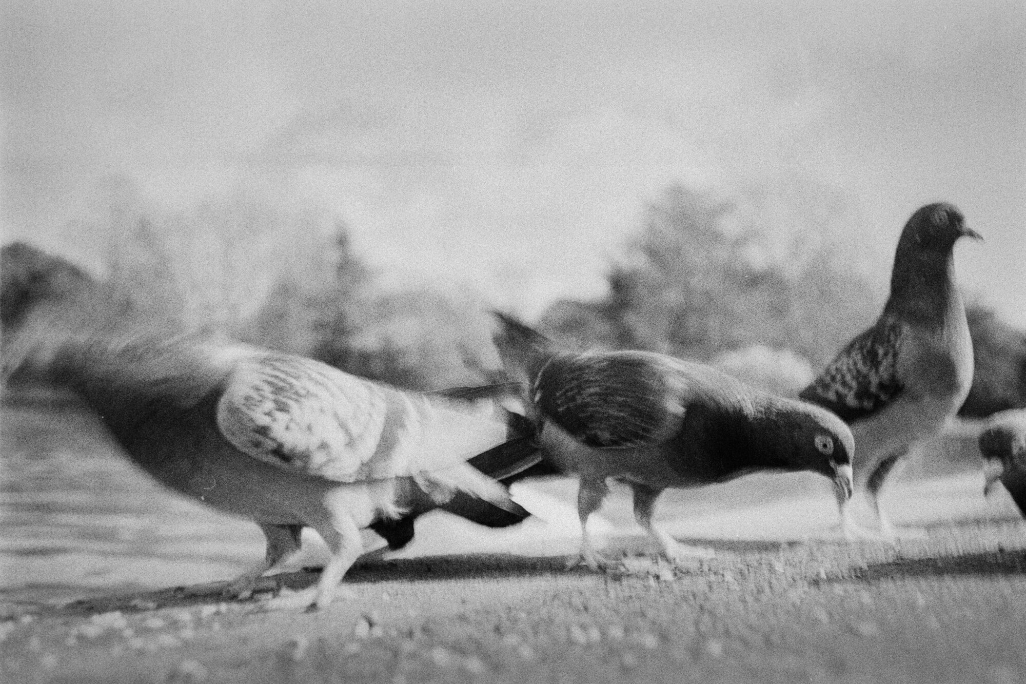
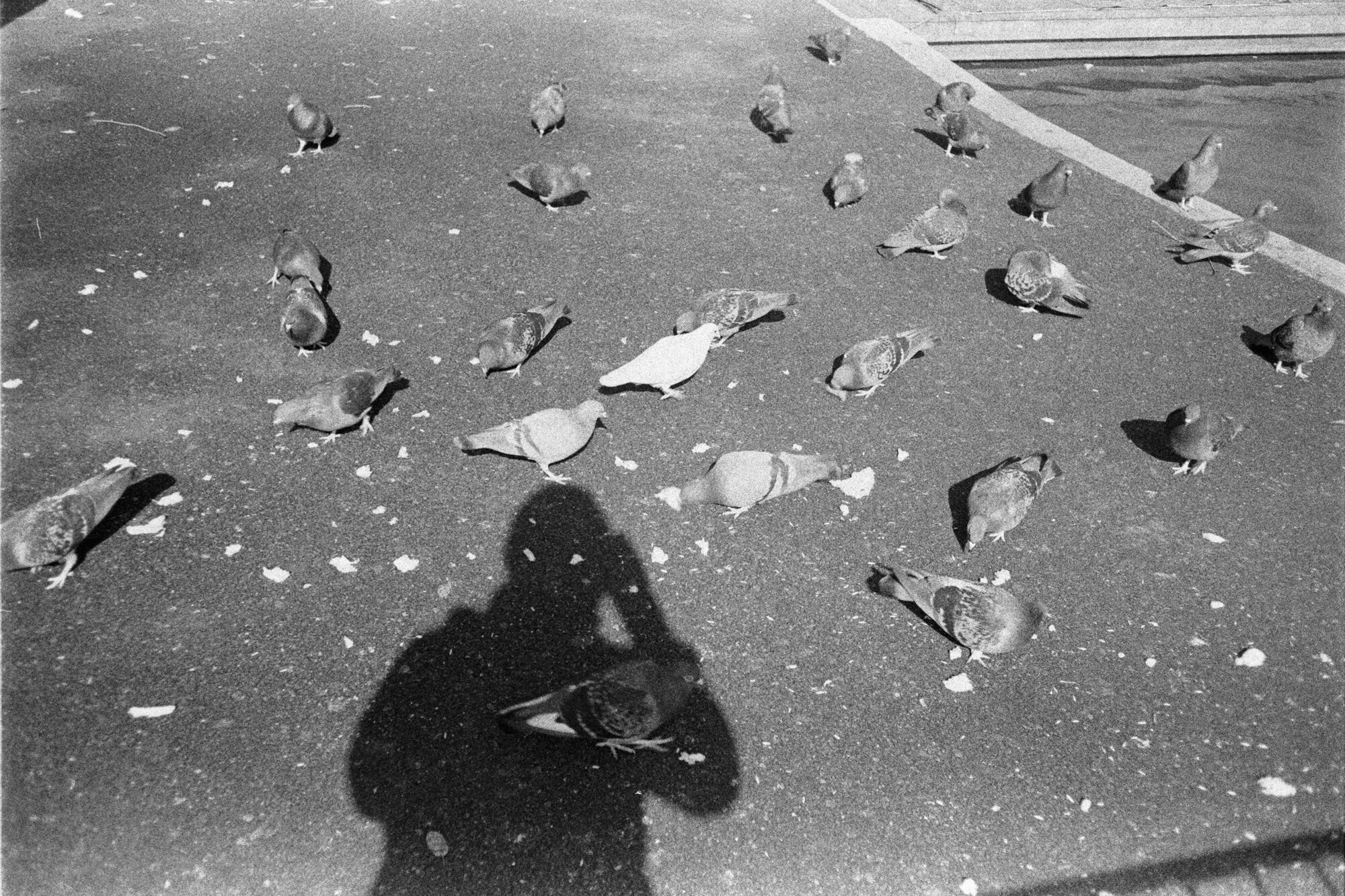
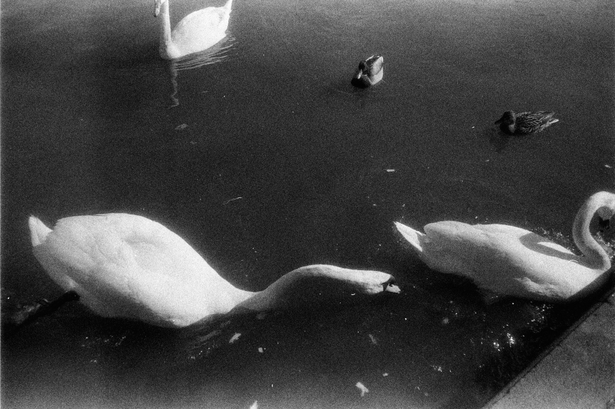
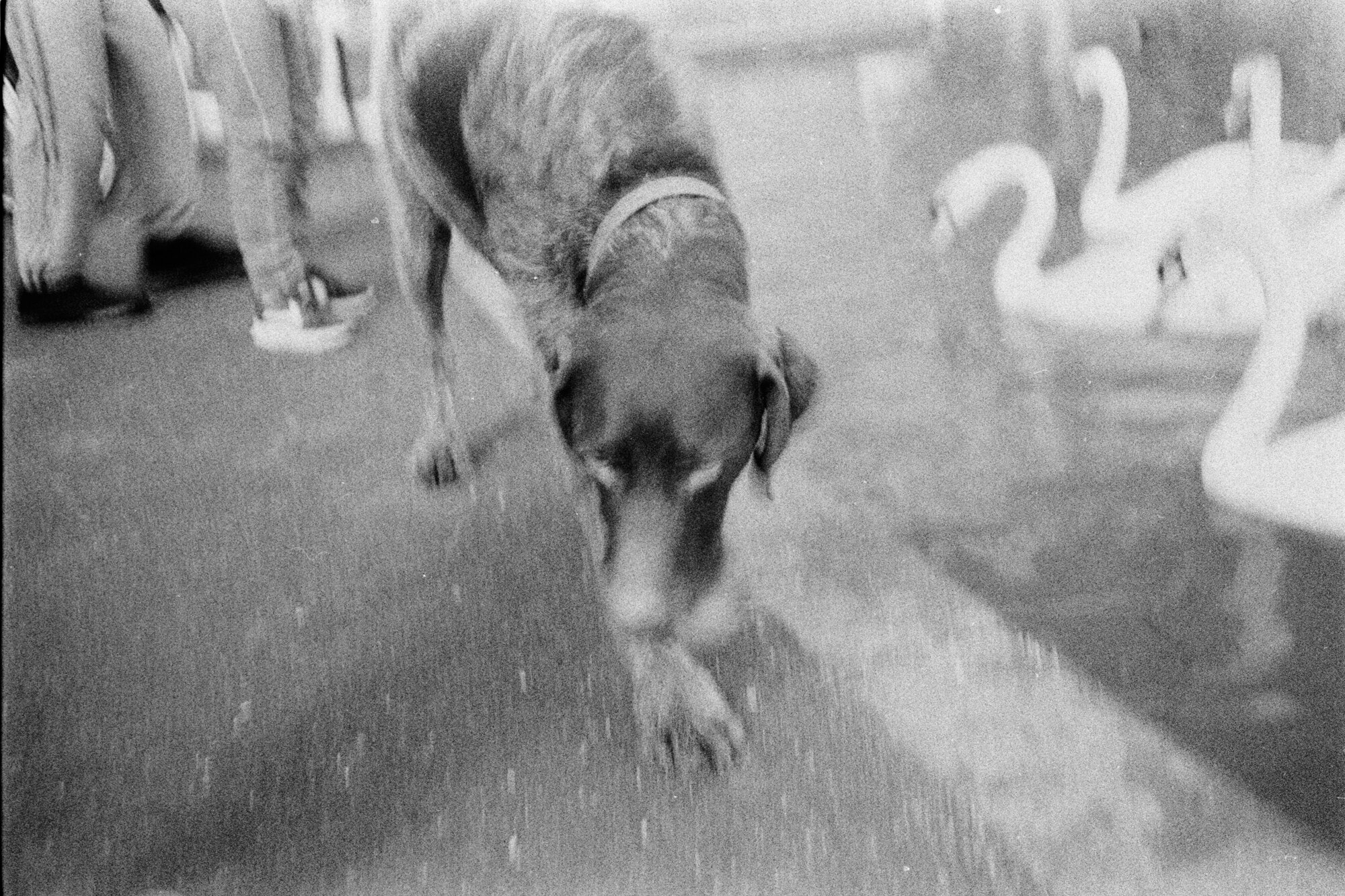
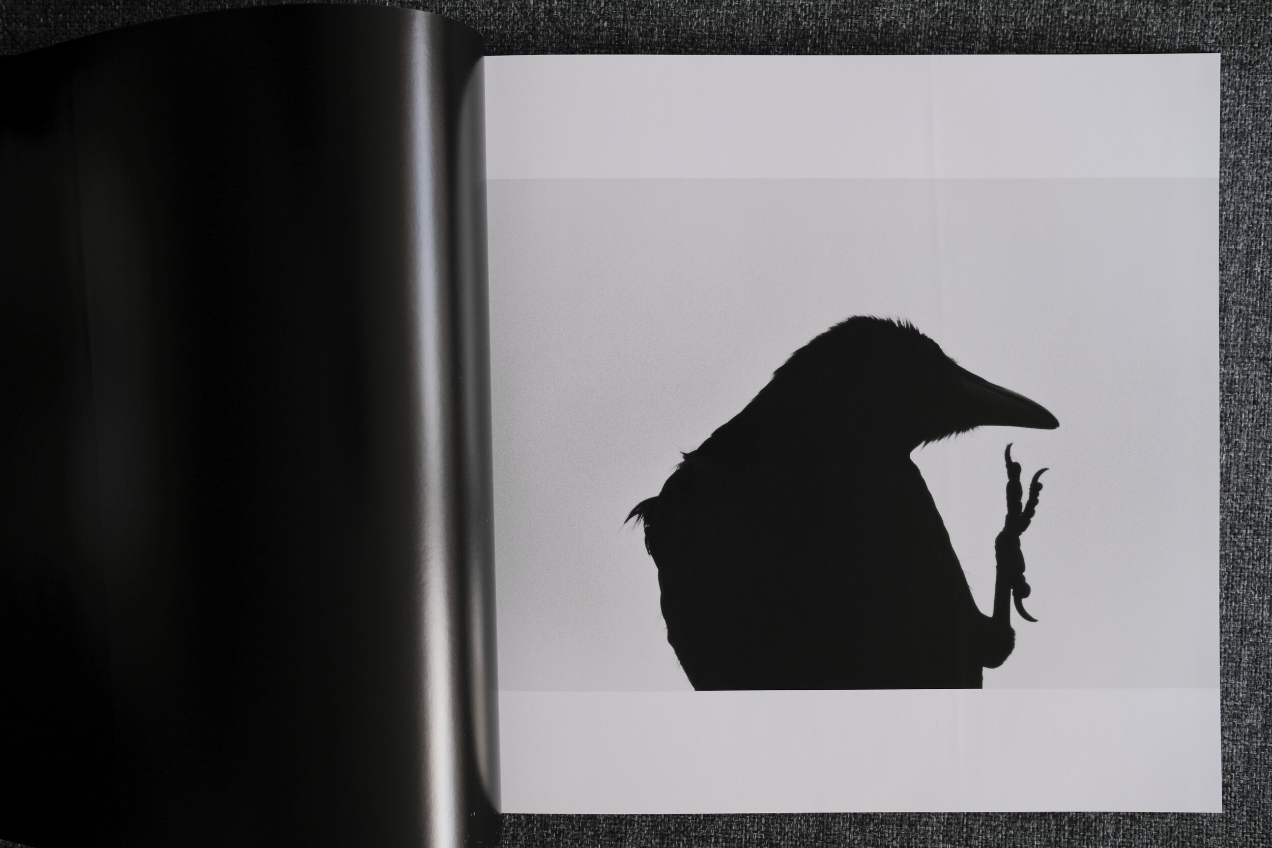
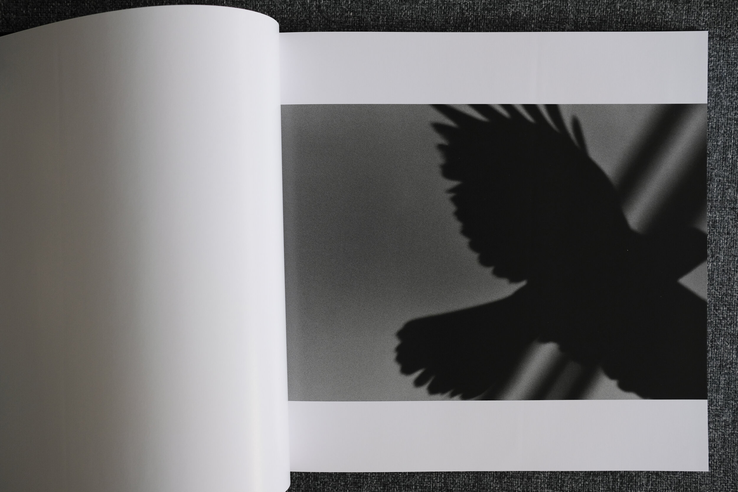
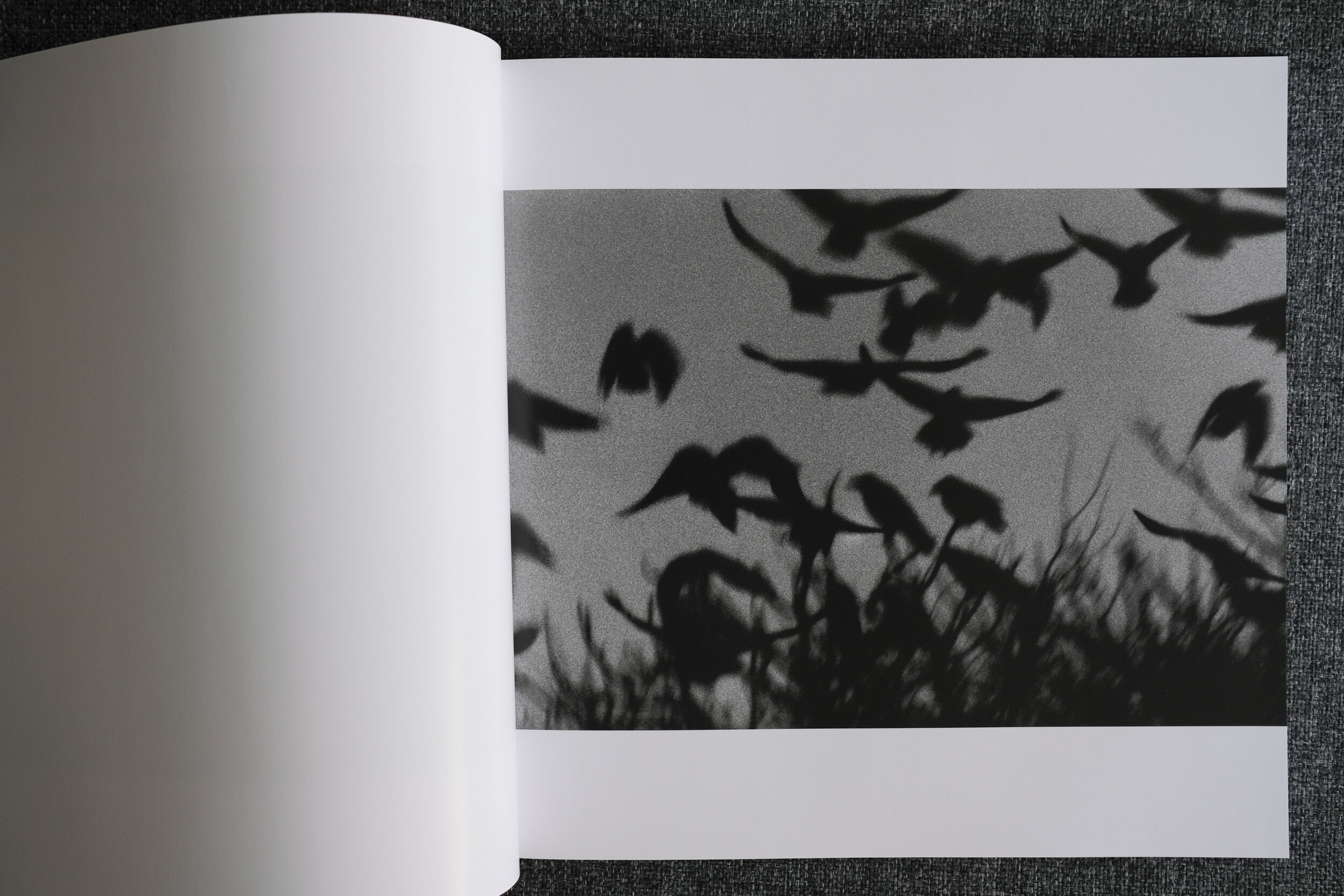
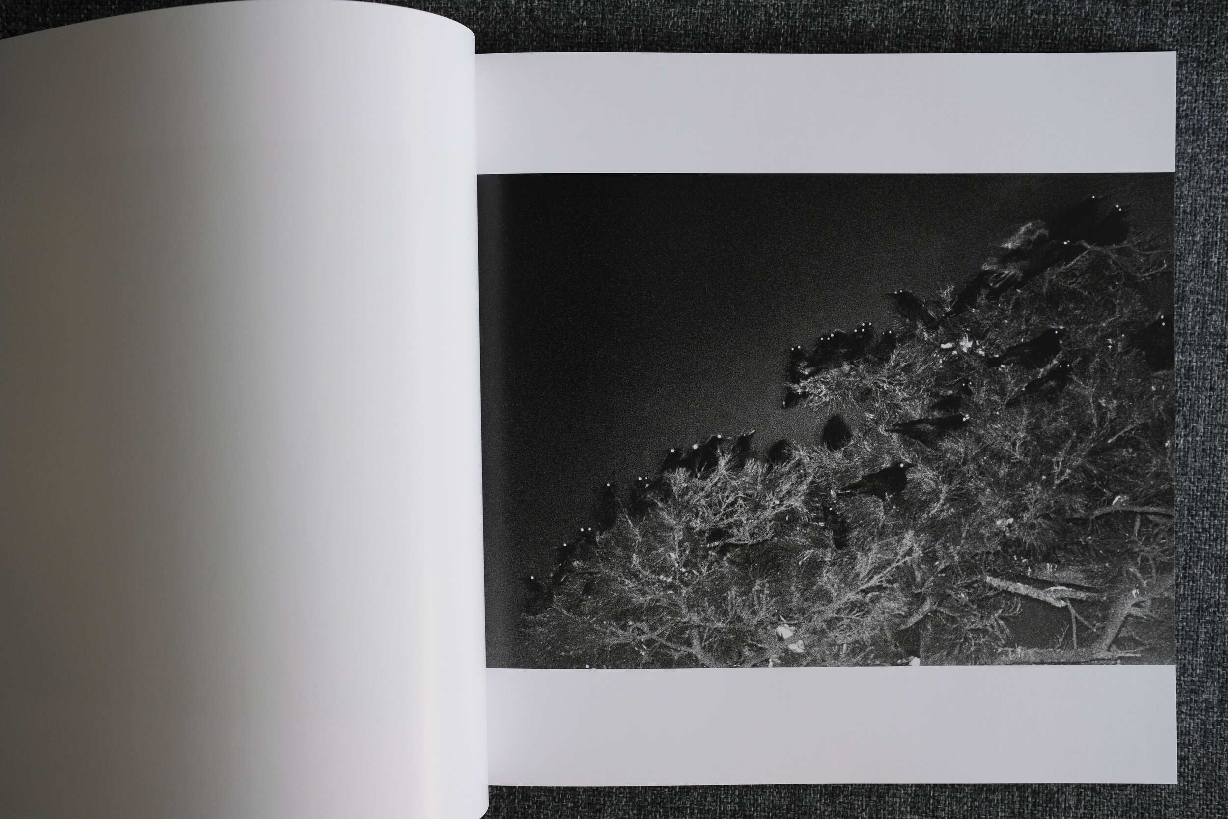
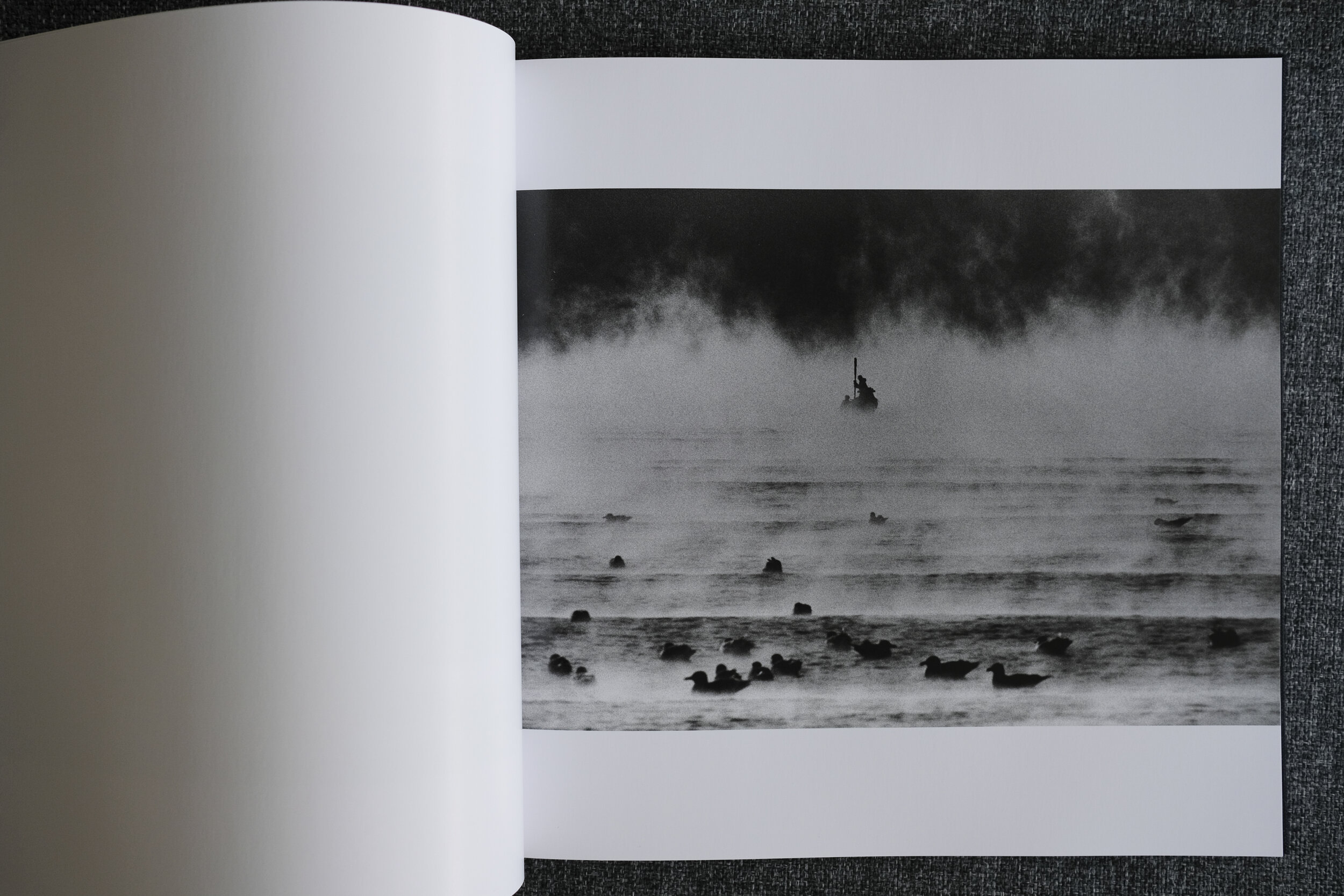
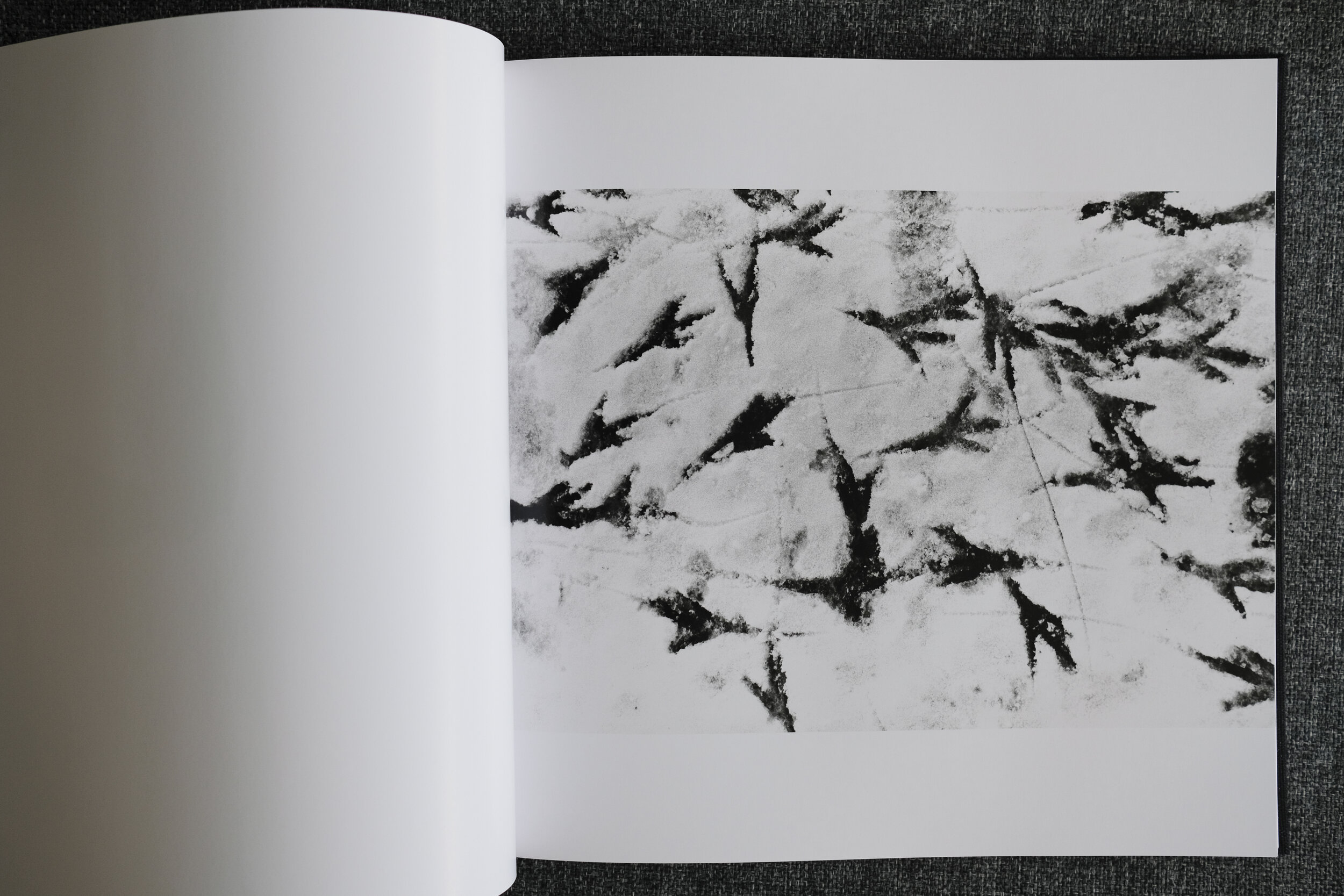
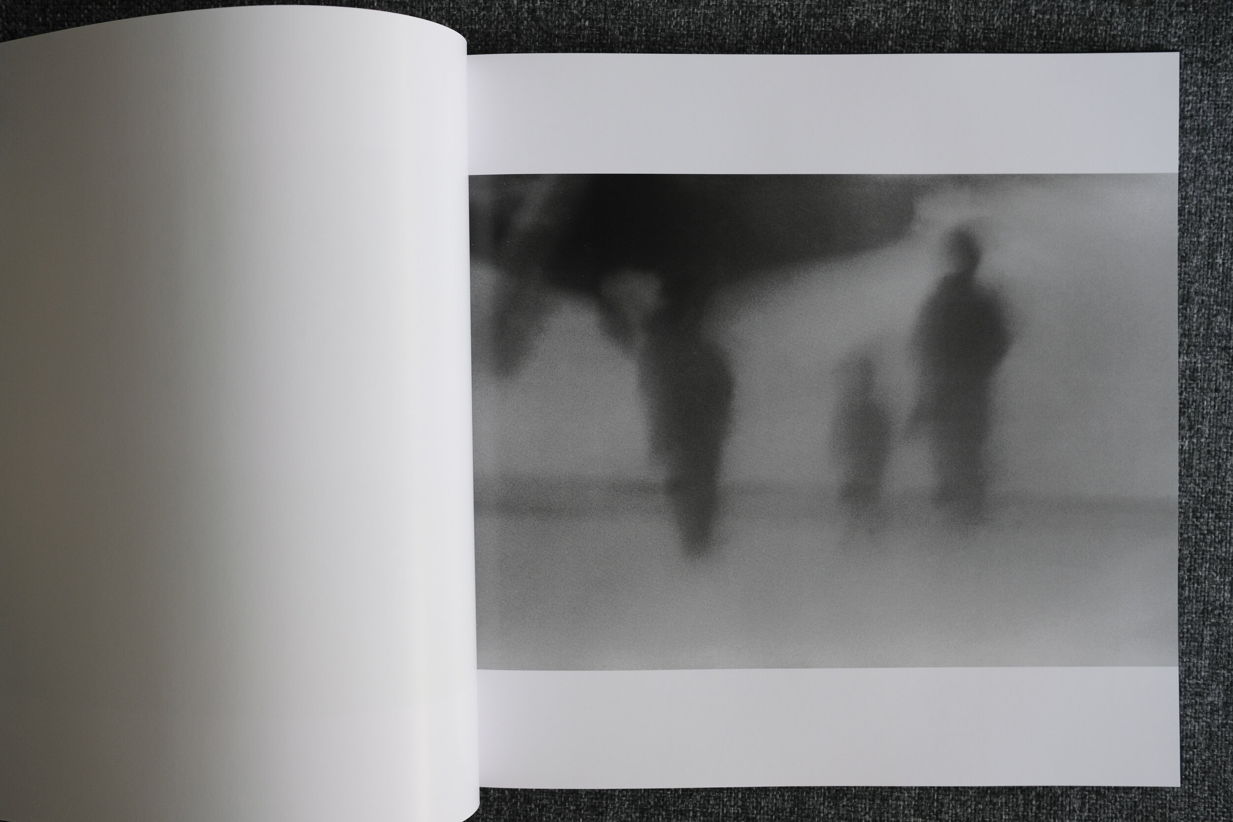
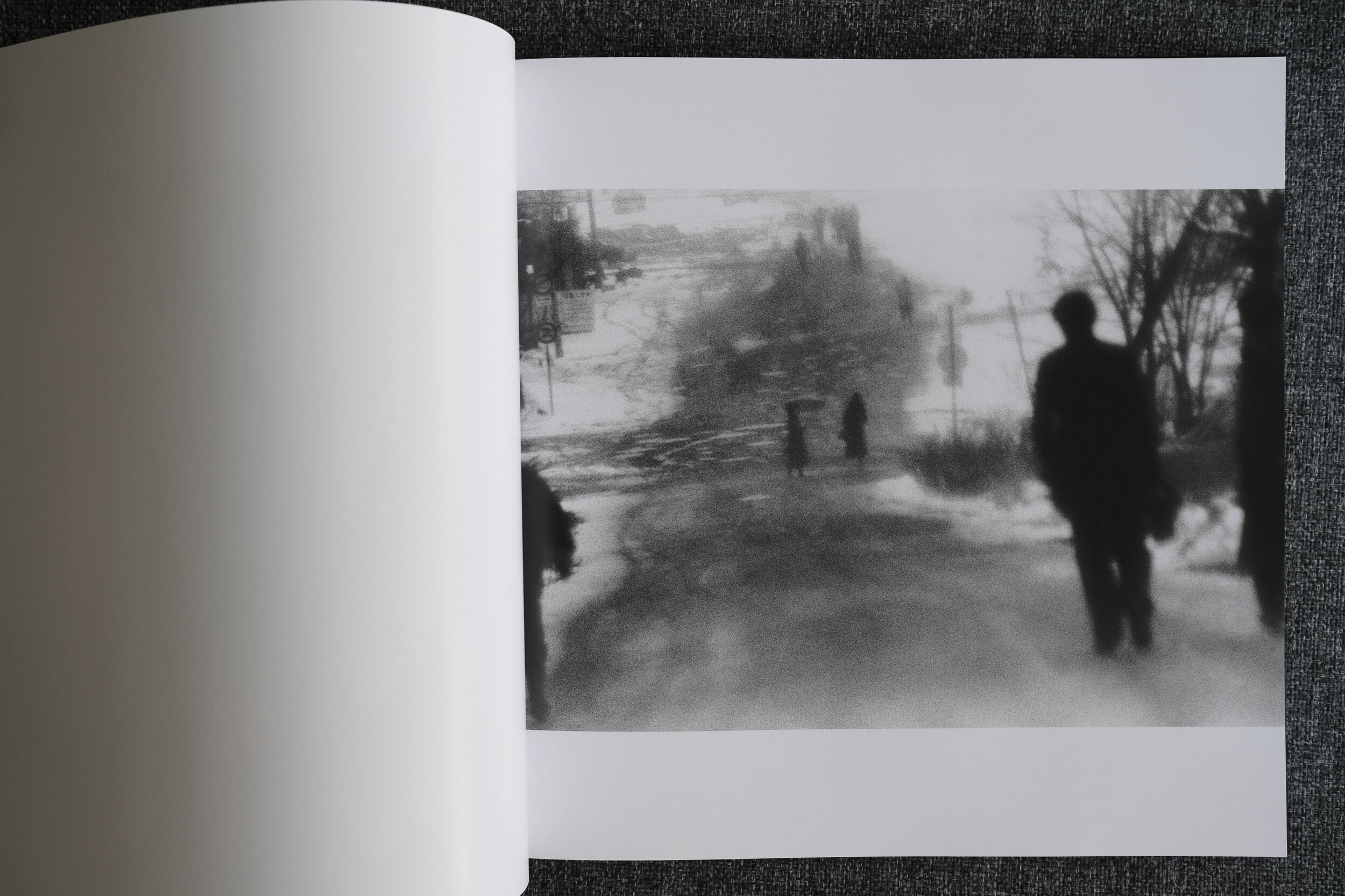
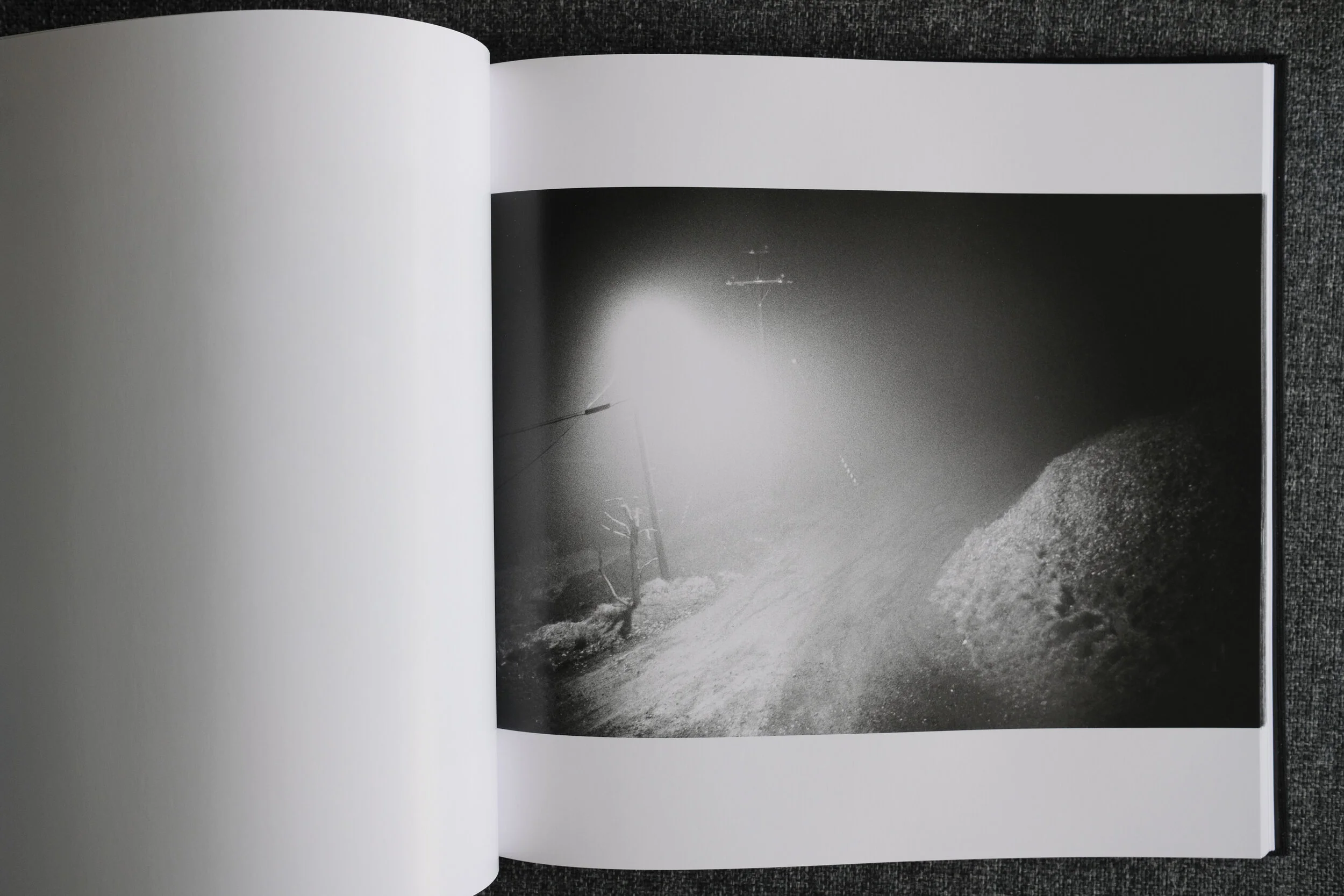
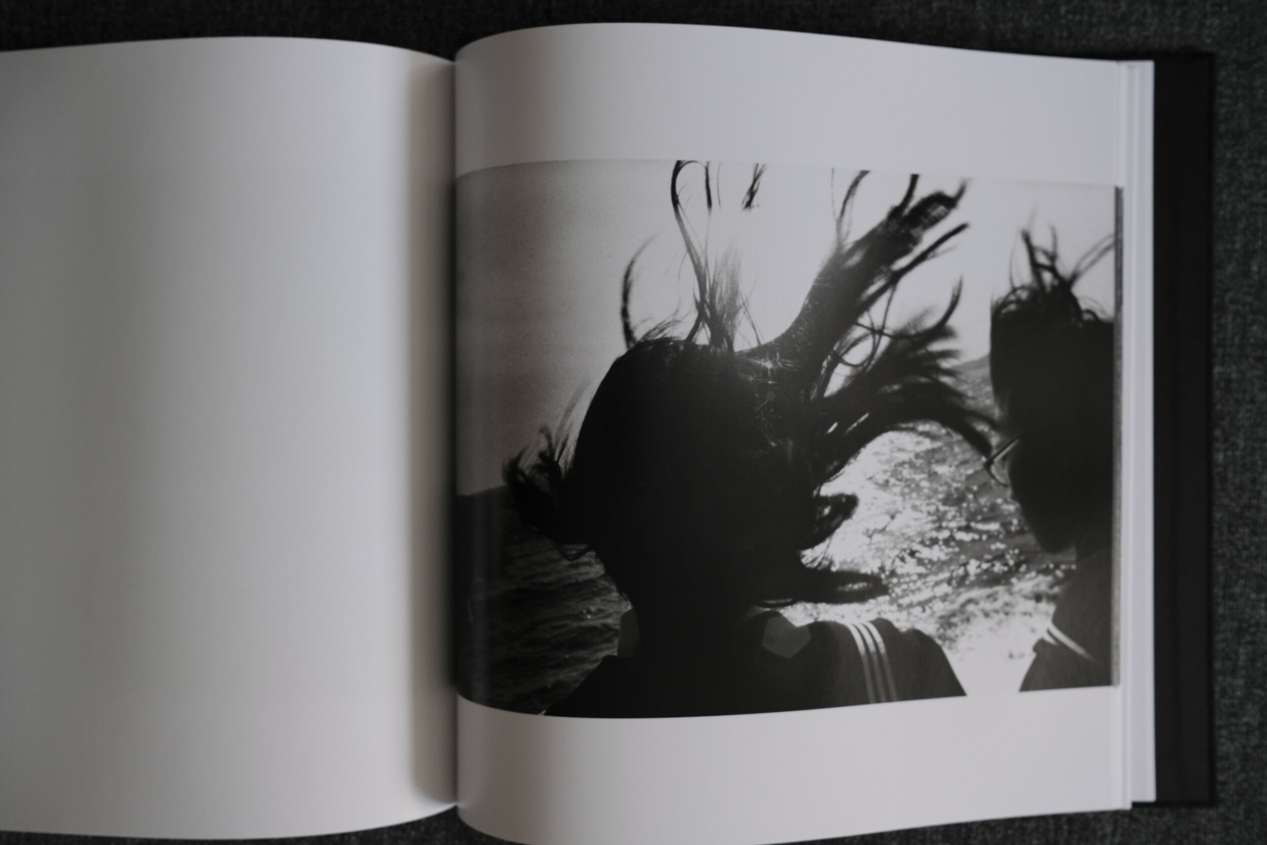
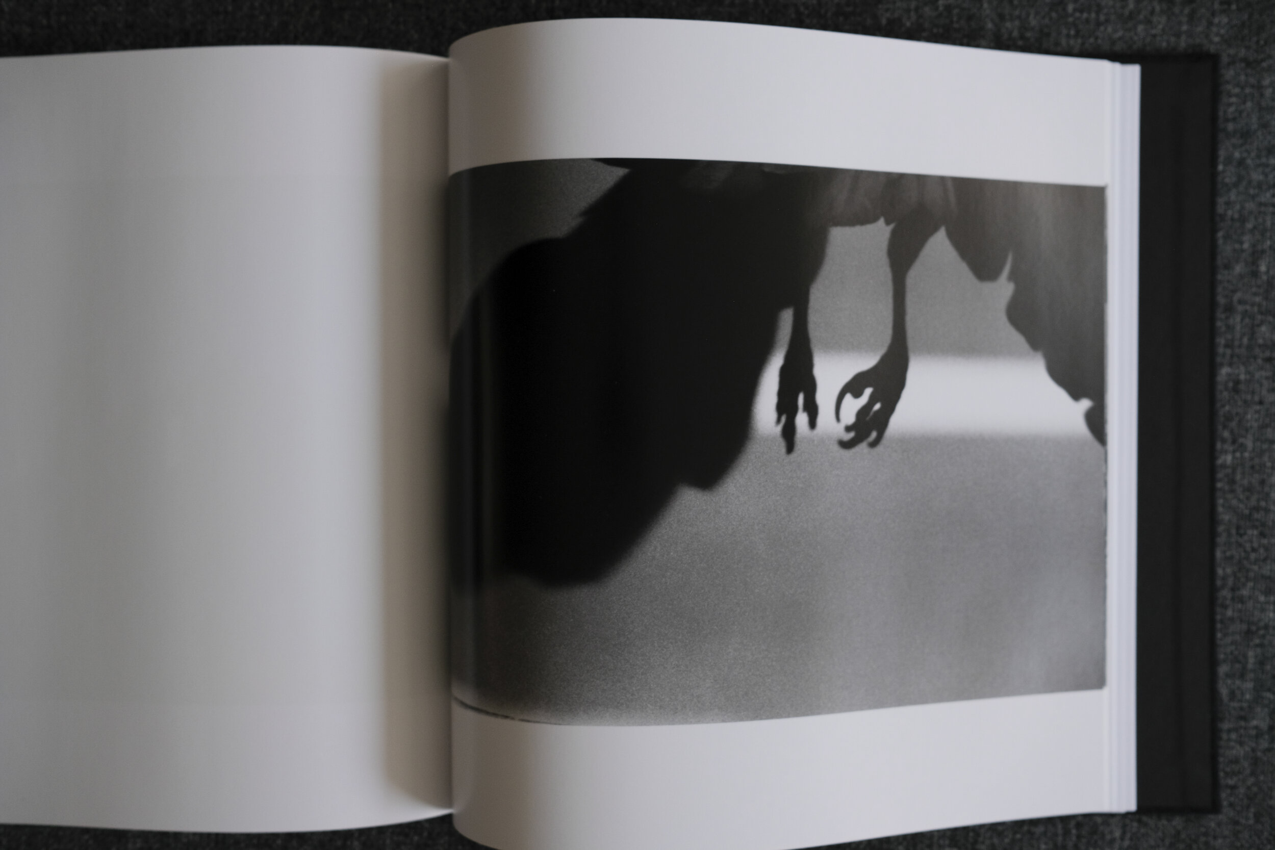
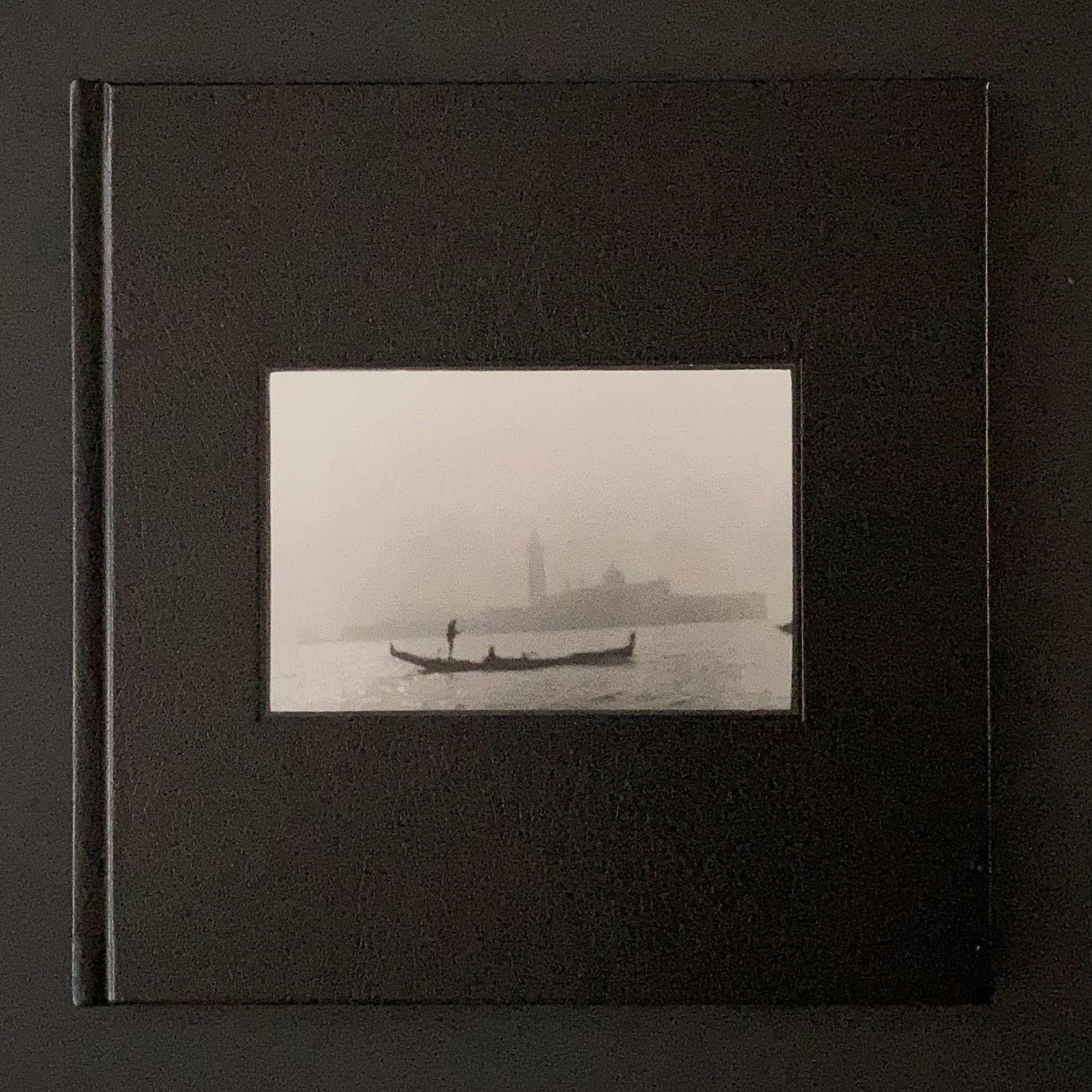
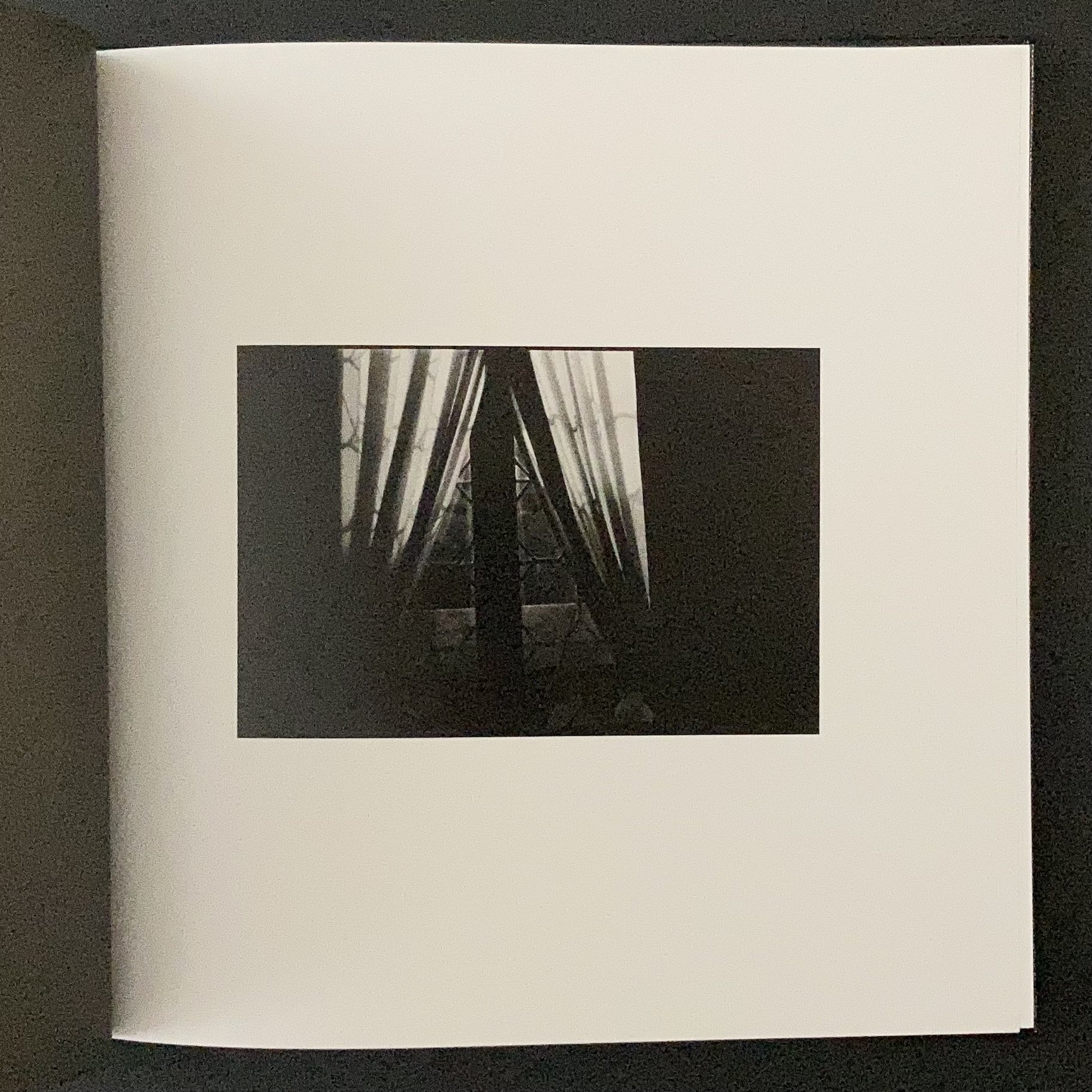
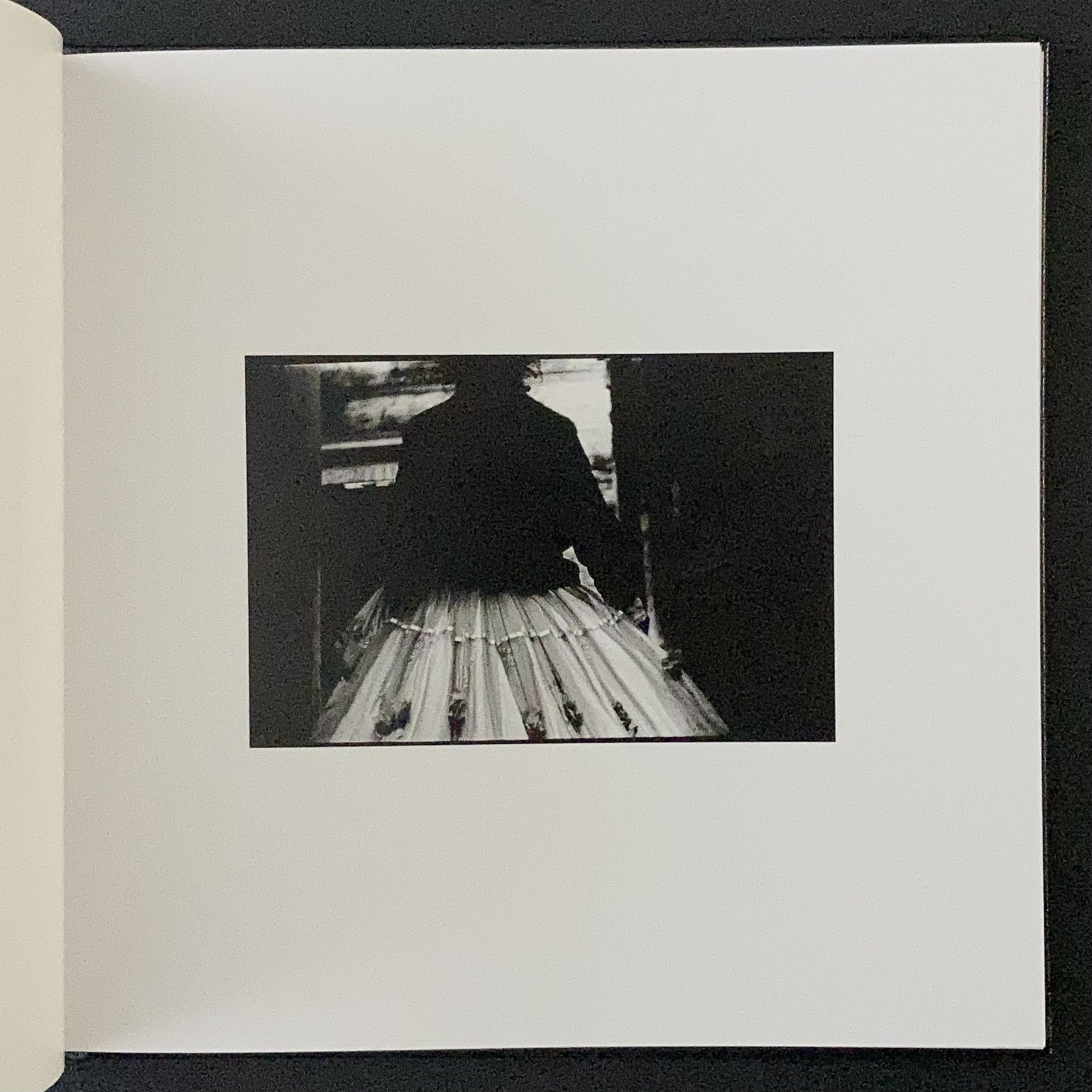
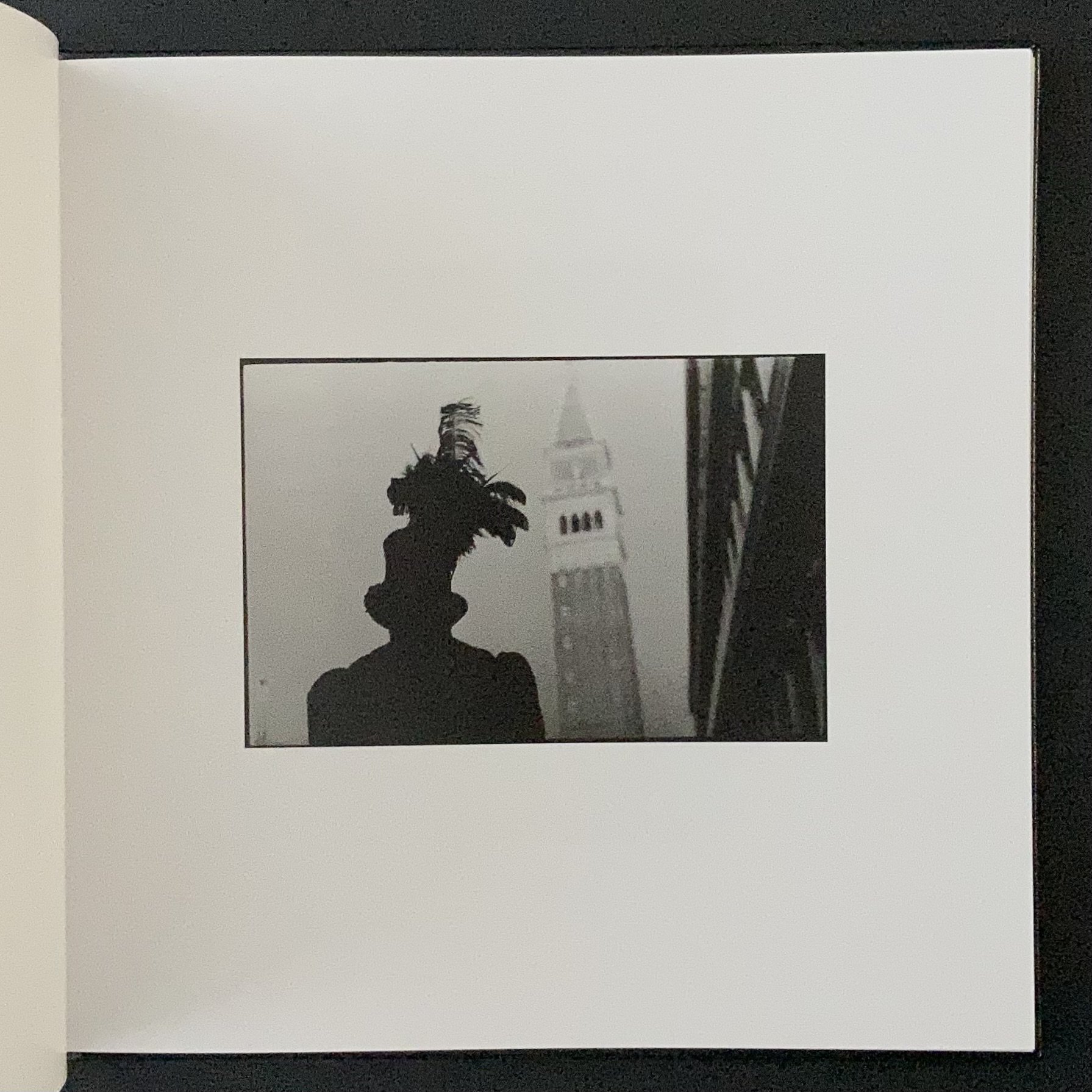
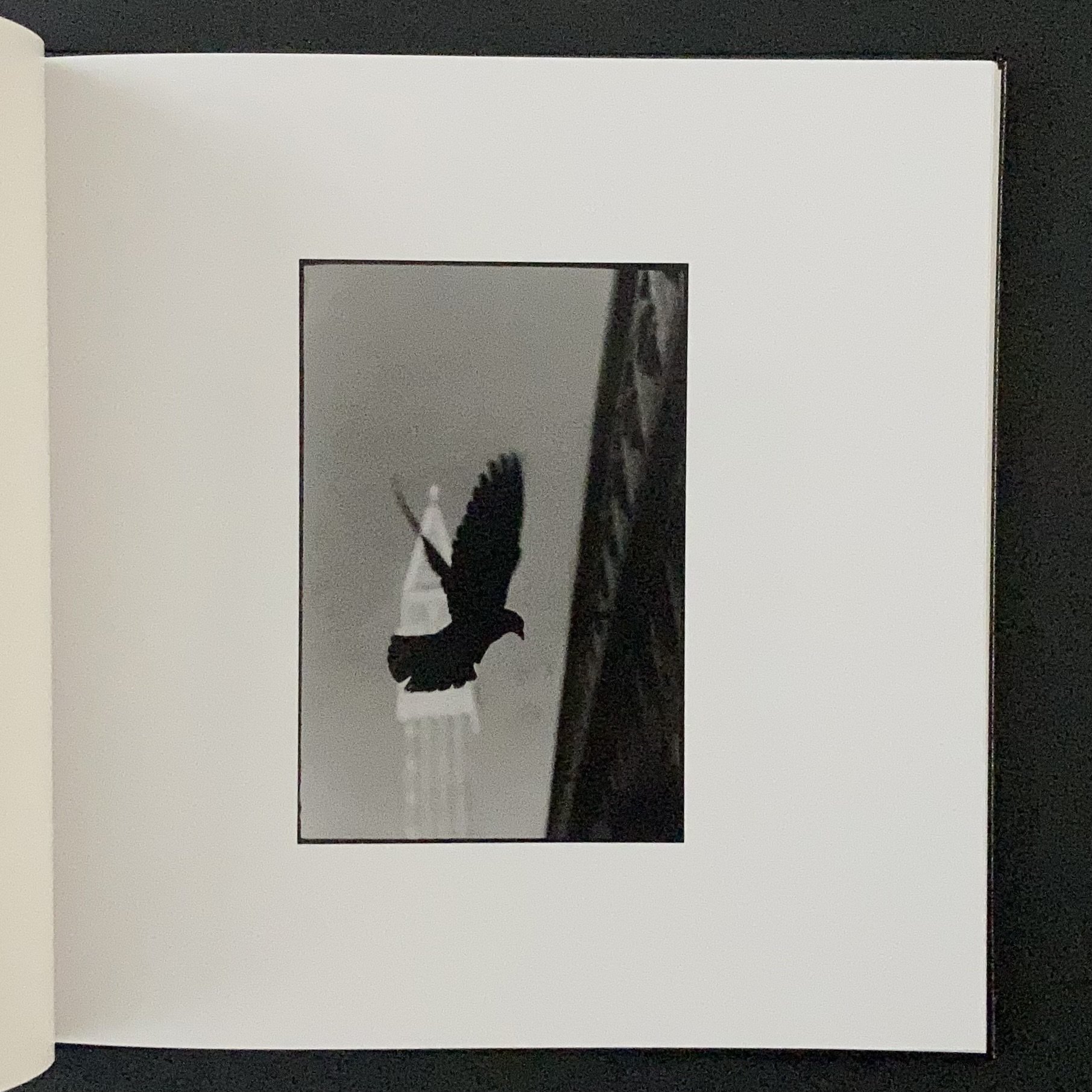
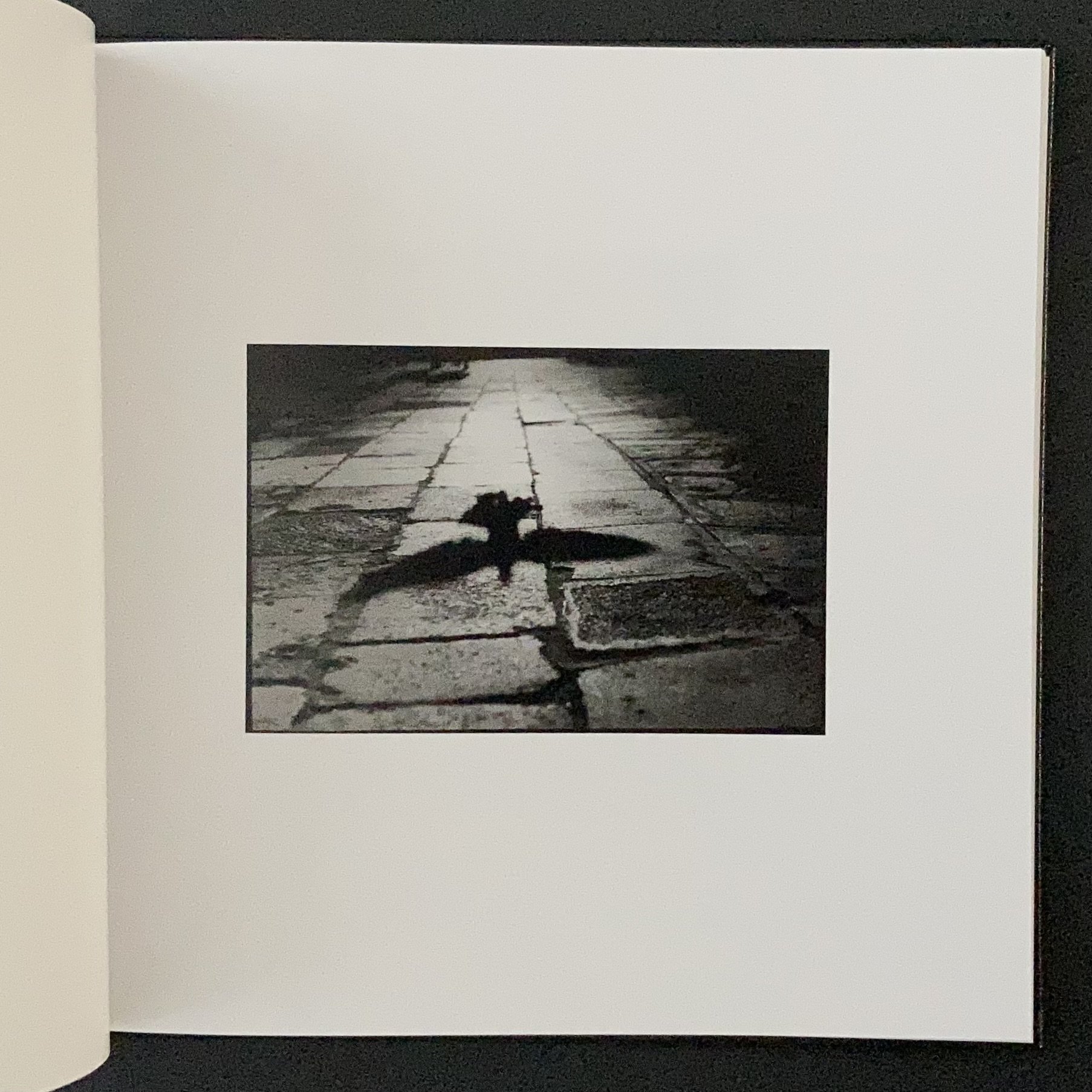
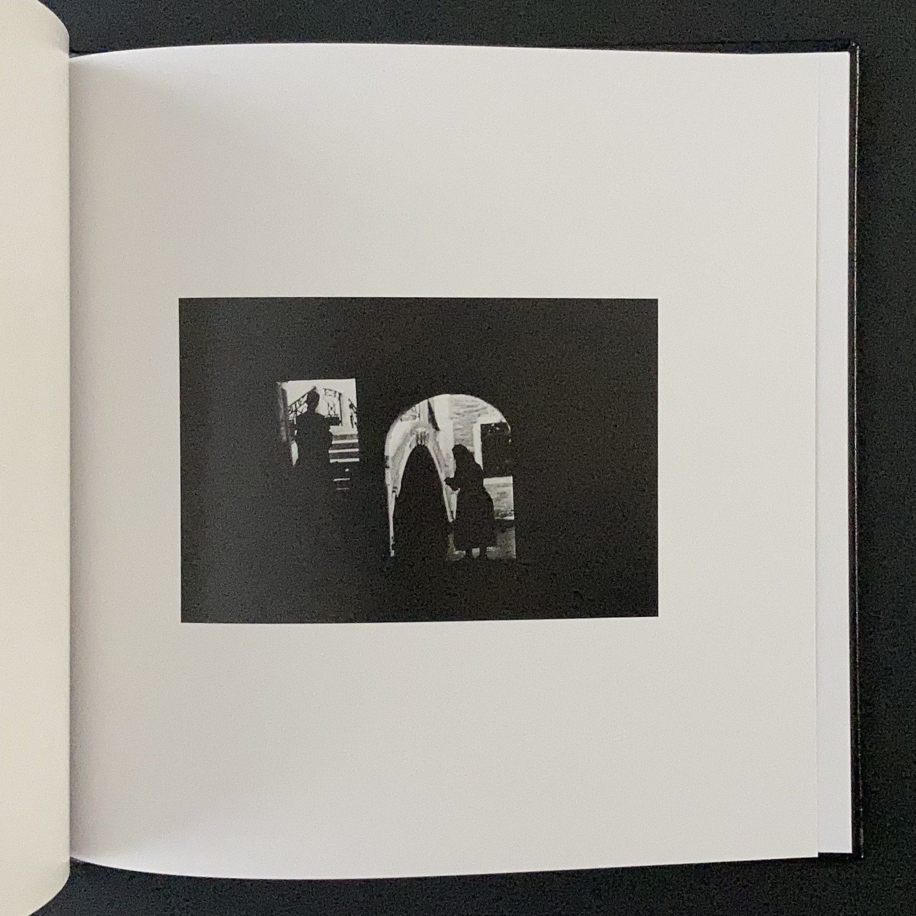
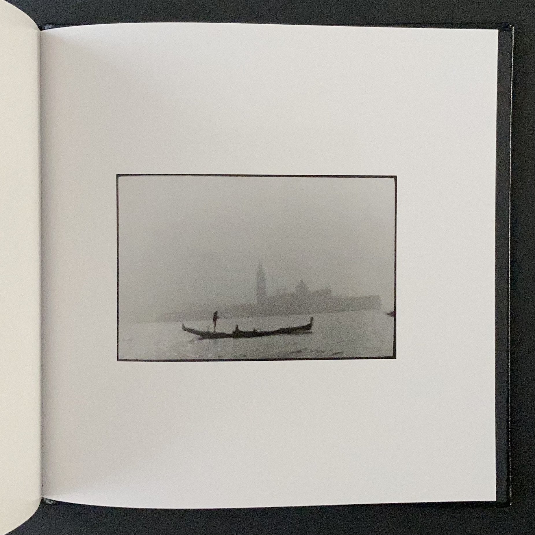
Giacomo Brunelli's latest offering sees him turning his eye and camera to Venice. He says that "Venice is a project I decided to start in response to the fragility of the city after the exceptional November 2019 'Acqua Alta' …" It is his first self-published book and in his unique style, Giacomo gives us an expressionistic and atmospheric interpretation of Venice.

For those not familiar with Giacomo’s work, it can be loosely summed up as film noir street photography. However, he has published books on subjects as diverse as animals (The Animals, his first book) and Self Portraits (published 2017). He has also published New York, Eternal London, and Hamburg.

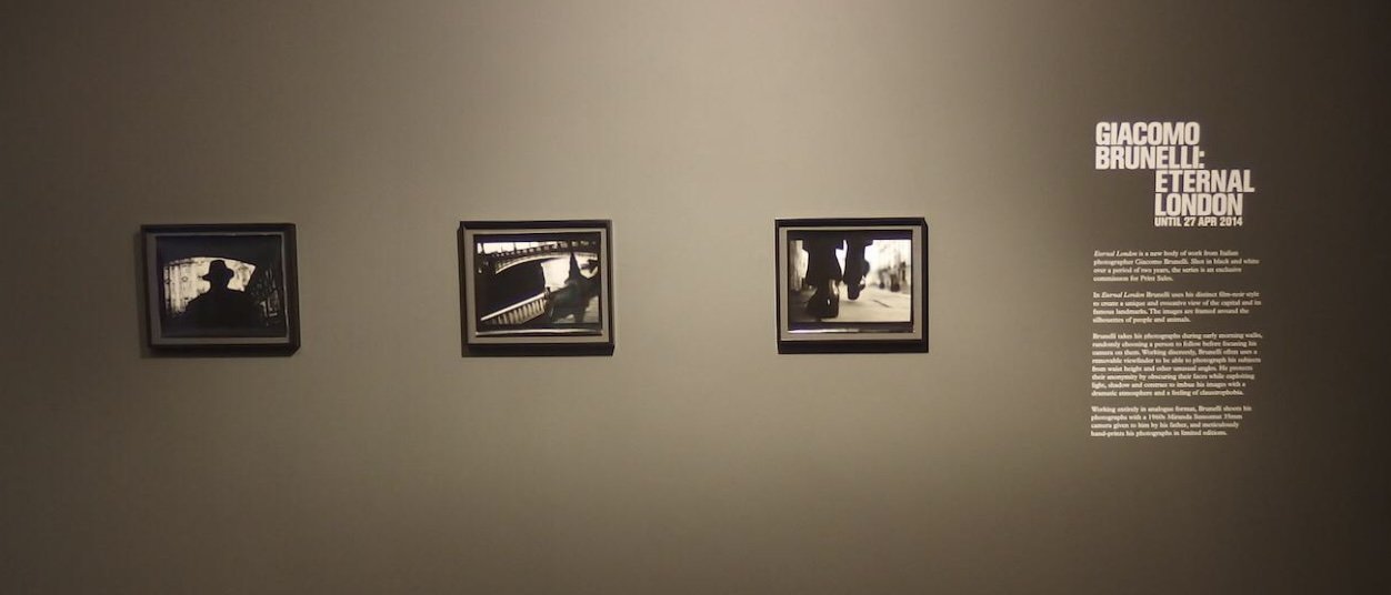
I first came across Giacomo's work through his book Eternal London (2016), which followed an exhibition at The Photographers' Gallery in 2014. I remember being struck by his style and it left a strong impression on me.


I made a modest contribution to Venice: I was fortunate to work with Giacomo in the very early stages of Venice, mocking up ideas for the cover, and then helping with the digital book layout.

The first 250 copies of Venice are numbered and signed. There are also two limited special editions of with prints (these are not in the book). Venice and other books are available from his website here . Venice is also available at The Photographers' Gallery bookshop here.

I have also made a photobook flip-through of Venice. You can view it on YouTube here.

JCH Street Pan 400 Black and White Film: The Near-Infrared Experience by Kyun Ngui

Searching For An ISO 400 B&W Film

Towards the end of March, as we entered longer days, I started looking for a 35mm ISO 400 B&W film to use during British Summer Time (March to October). My go-to film during the dark winter months had been Kodak TMAX P3200 but with longer and brighter days, I wanted to use an ISO 400 film.

For some time now, I have found myself drawn to black and white infrared (IR) images but the downside of IR photography, for me, is the slow shutter speed that necessitates tripod use while I like to do hand-held shooting. True IR films also needed to be loaded into and unloaded from the camera in darkness: not practical with the Leica’s film loading system.

A black and white infrared (IR) image looks like this:

Black and white infrared image. This is not mine and I don’t own the copyright to this image.

Black and white infrared image. This is not mine and I don’t own the copyright to this image.

The infrared in the leaves and grass shows up white through an IR filter and the clear parts of the sky turn dark.

The reason why IR photography uses slow shutter speeds is because you have to use an IR filter to cut out nearly all the visible light (that means near complete darkness) and only lets in the infrared light, which is not in the visible part of the spectrum (see below).

The Infrared part of the spectrum is between 700 - 1000 nm.

The Infrared part of the spectrum is between 700 - 1000 nm.

Relax. You can open your eyes now. The physics lesson is over.

Given the hurdles in IR photography for me, I was intrigued when I heard about JCH Street Pan.

JCH Street Pan ISO 400 Black and White Film

Before I go on, I’d like to say up front that this is not a film review. I am not interested in comparing its properties with other films and what one might or might not do with it. I am merely sharing my experience with it.

JCH = Japan Camera Hunter aka Bellamy Hunt. He lives in Japan and sources rare, high quality film cameras for customers around the world. He has now branched out to produce his own film, the JCH Street Pan.

I did some brief research on the web (not much) and I read on a few forums that it’s a discontinued surveillance film. Some people have no problem developing it and getting good results while some have. It seems to me that people either loved it or loathed it with not much in the middle.

The most intriguing thing for me about the film is that, according to its product description: “when paired with a dark red filter, you’ll find that this high contrast black and white film can also act as an infrared film  — with high sensitivity in the IR range.”

JCH-400-3Dbox1-720x540.jpg
 

Here was a regular black and white film (it doesn’t have to be loaded and unloaded in darkness) that is medium fast (that means it can be shot hand-held, especially if I can push it +2 stops).

The only thing that gave me pause was the price tag: at £11 a roll, it was not a budget price tag. That’s only a shade over the Kodak TMAX P3200. However, I decided I wanted to try out the near-IR effects and so I bought four rolls.

I also needed a dark red filter and after some research, I went for a Tiffen Dark Red #29 filter.

I had intended to push JCH Streetpan two stops to ISO 1600, which would allow me to comfortably hand-hold my camera but the only development time I found for a +2 stop development was with the Kodak HC110 developer but because of Covid-19 supply chain disruptions, it was nowhere to be had in the UK.

There was nothing for it but to shoot the film at box speed (where there was a range of developers available) and hope that a 3-4 stop drop would not cause too much camera shake. But then again, blur in an image is not an issue for me.

Messed Up The Development

After shooting a couple of rolls, it was time to develop them. Here I came across a snag: the dilution for Ilfosol 3 as given inside the film box as 1+3 with a development time of 5 minutes. This is not the standard dilutions for Ilfosol 3, which are 1+9 or 1+14. For those who don’t develop film, that means 1 part developer to x part water. A 1+3 dilution means it’s 3x stronger than a 1+9. Plus, it’s a non-standard dilution. Was it a typo?

I was impatient to see the results, so I decided to go with my normal 1+9 dilution but compensate for the weaker dilution with more development time (6.5 mins vs 5 mins). The result was that it was very much under-developed! Negatives were grey and there was not much tone separation. I couldn’t even see the frame numbers! However, there were still enough details on many frames to be useable, like this one below:

Developed using Ilfosol 3, 1+9 dilution, 6m 30s, 20 deg C - would not recommend this dilution and time! The film was under-developed.

Developed using Ilfosol 3, 1+9 dilution, 6m 30s, 20 deg C - would not recommend this dilution and time! The film was under-developed.

After that not very successful attempt, I decided I’d give the recommended dilution (1+3) a try. This one came out better but also seemed slightly under-developed. I was rapidly losing my enthusiasm for JCH Street Pan.

Embrace The Flaws

However, even if there are imperfections, there is always something useable. The imperfections themselves could be used to advantage.

In these under-developed rolls were some of my favourite pigeon images ever. Because the IR filter forced me to use a slow shutter speed, it produced movement blur which really added a certain subtle dynamism to the images, like the rustling of leaves in a gentle breeze.

One of my favourite pigeon images of all time. Shot with JCH Street Pan.

One of my favourite pigeon images of all time. Shot with JCH Street Pan.

The Iconic Dog Image

Moriyama has his stray, Koudelka his black and now I have mine.

Mine is not iconic yet, of course, but give it time!

JCH-4.jpg

The Near-IR Effect

For rolls 3 and 4, I thought I’d really test the film’s near-IR effect and so I shot a lot of leaves and trees, and also skies (to see if they do turn very dark). I ordered some Ilford ID-11, a popular, well-established powder developer which has essentially the same formula as Kodak D76. I got much better result with ID-11 using the dilution and timing given on the inside of the film box. The negs were properly developed and tones separation was good.

Below are some images from rolls 3 and 4:

Where Next With JCH Street Pan?

This film gave me a few of my all-time favourite images and for that, I am grateful that I gave it a go. However, there were too many inconsistent negs where parts of the similar light values would suddenly be lighter or darker than the surrounding parts. Together with the high price tag, I don’t find many compelling reasons to use it on a day to day basis. That is not to say I won’t use it again in future. I might well do when I want that certain look and feel.

For now, the search for an ISO 400 B&W film continues …


Links

I got my JCH Street Pan from Analogue Wonderland here.

Japan Camera Hunter website

Tiffen Dark Red R29 Filter: Amazon UK, Amazon US, Tiffen US

Note: I don’t get any commission or receive any financial rewards when you use these links.

Ravens by Masahisa Fukase by Kyun Ngui

Consistently proclaimed as one of the most important photobooks in the history of the medium, Ravens by Japanese photographer Masahisa Fukase was first published in 1986. Interpreted as a personal and political allegory for post-war Japan, it is a brutal yet beautiful story of love and loss.

“Masahisa Fukase (1934-2012) is renowned for his obsessive, intense and deeply introspective photography through which he articulated his passionate and occasionally violent life. Fukase’s body of work is remarkable for the extraordinary range of visual perspectives that it encompasses.” (Michael Hoppen Gallery)

Fukase’s work has been exhibited widely at institutions such as MoMA, New York, the Oxford Museum of Modern Art, the Foundation Cartier pour l'Art Contemporain, and the Victoria & Albert Museum.

My own takeaway from what I have learnt about Masahisa Fukase is that he was a troubled artist who had difficulty relating to the world and to others and his photography became a search for self, at the expense of others including his wife and his marriage. He suffered from “existential angst and anhedonia” which “manifested in artistic self-identification with the raven and ultimately spiralled into a solitary existence and artistic practice on the edge of madness”. (Tomo Kosuga, Essay in Ravens, MACK 2017)

Born in 1934 in Hokkaido, Masahisa Fukase was the eldest child of a family who ran a family photography studio, which he was expected to take over. However, after he went to Tokyo to study photography, he became fascinated with the city and settled there.

Prior to Ravens, he had published two major books: Homo Ludence (1971), comprised of pictures of his troubled life over a ten-year period, and Yohko (1978) a book of his wife, made with painful perseverance through conflict and self-imposed separation. It was in the last period of his marriage with Yohko that be began work on Ravens.

“The start of the series was a home journey to Hokkaido in 1976. He was forty-two years old at the time. His life was in tatters due to issues with alcohol and the imminent collapse of his decade-long marriage. Unable to handle the situation, Fukase left Tokyo in the hope of escaping his problems.” (Tomo Kosuga, Essay in Ravens MACK 2017)

Ravens was published in 1986. In 1992, only six years after its publication, Fukase fell down the stairs of his favourite bar and remained in a coma for the next 20 years until his death.

Brutal? Yes. Lonely? Unbearably. Especially when you know about the internal and external struggles of the artist. But in this work, there is also a kind of beauty. A beautiful exposition of isolation and intense pain. It is perhaps best summed up by Akira Hasegawa in the Afterword to the book:

“The world that Fukase occasionally captured was a form of hell. And, the artistry to form works of art out of hell is Fukase’s alone.”